︎
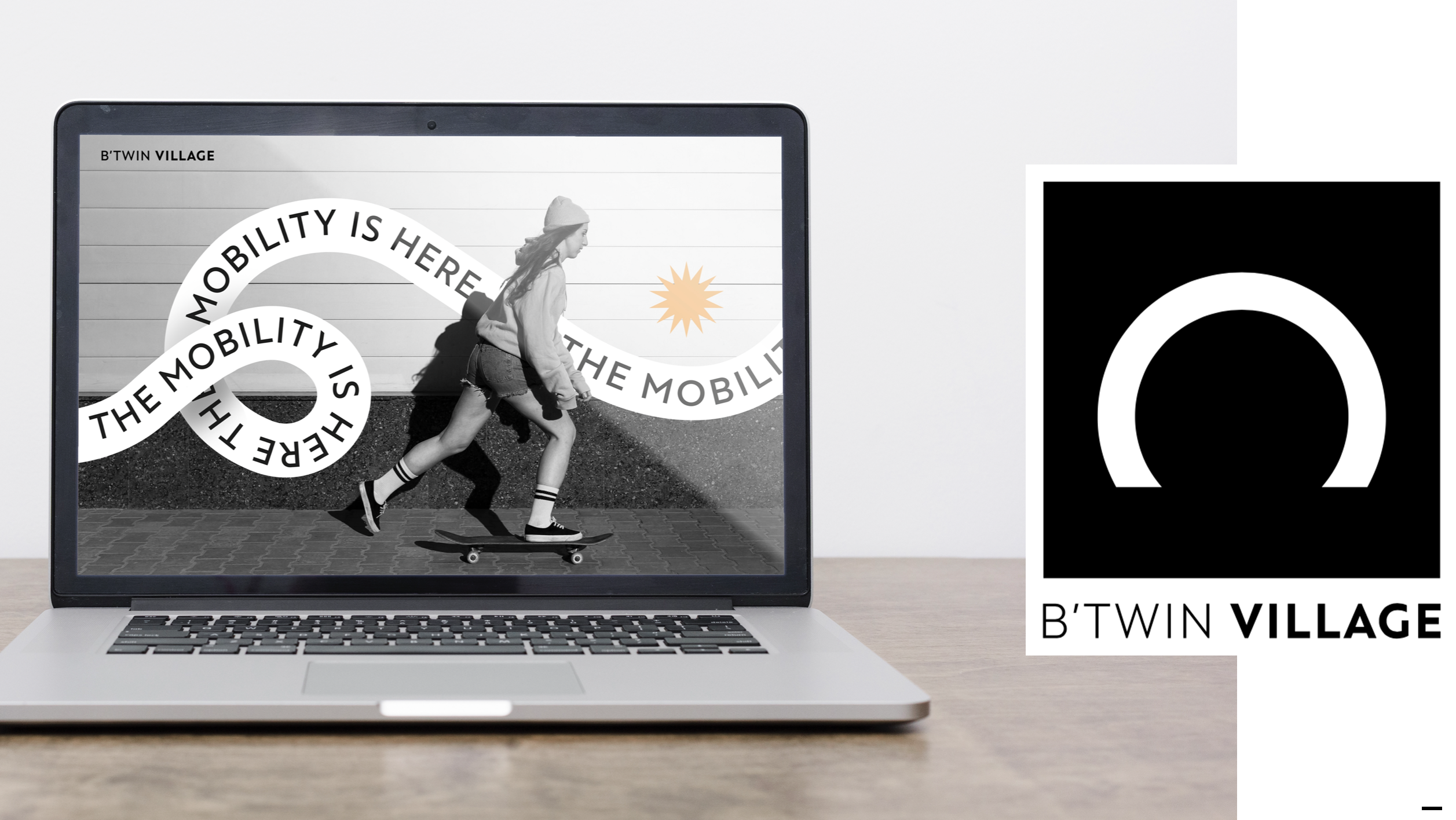
B’TWIN VILLAGE
B’TWIN VILLAGE
Visual identity design for B’twin village,
urban mobility center by Decathlon
commissioned by Nofilter /2022
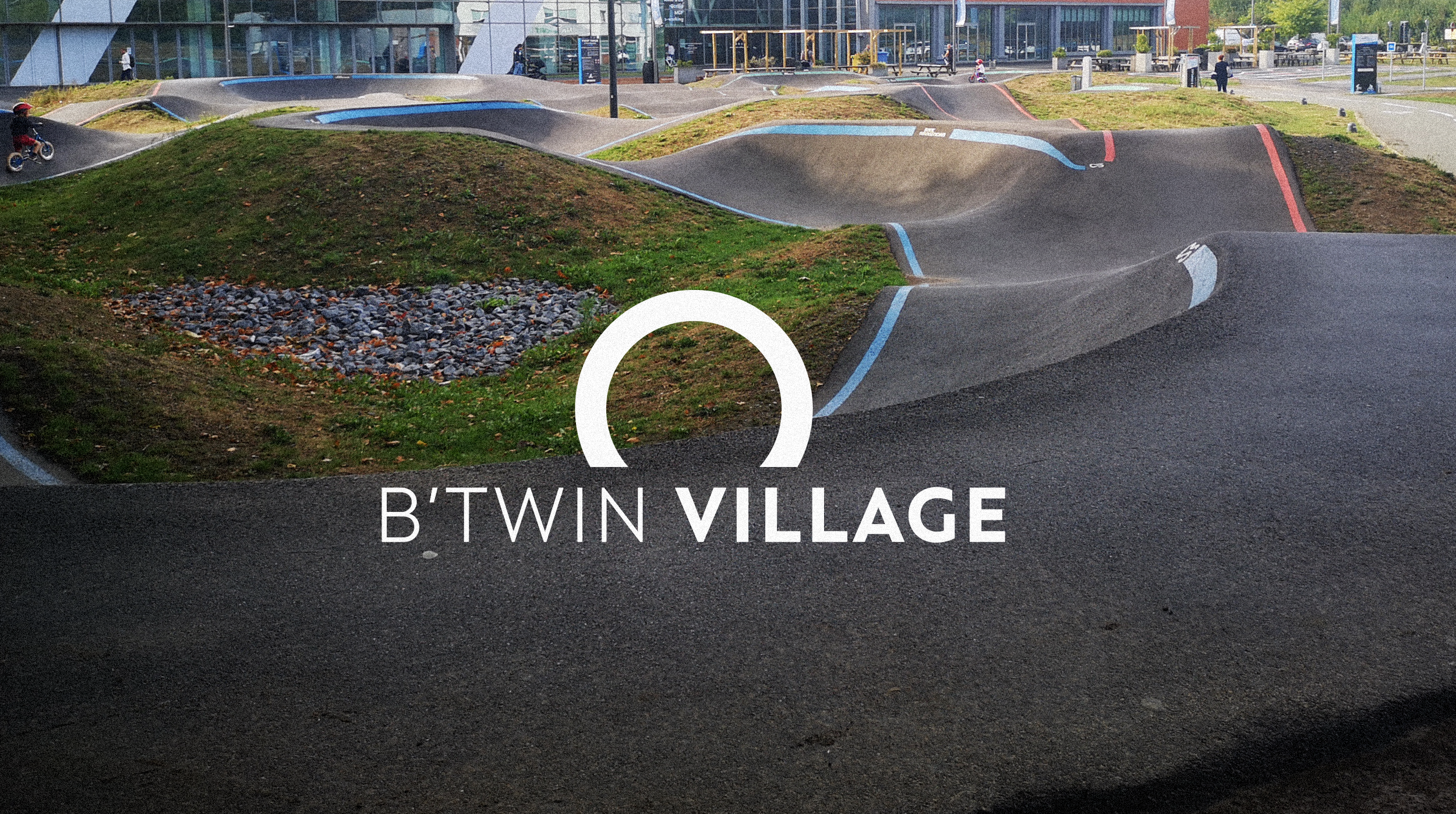
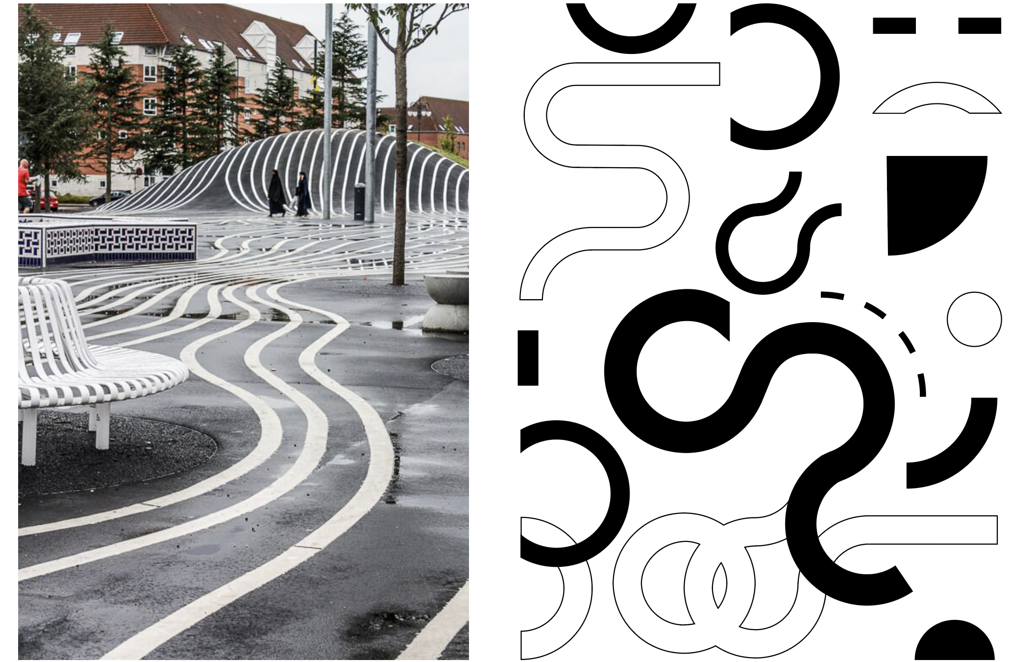
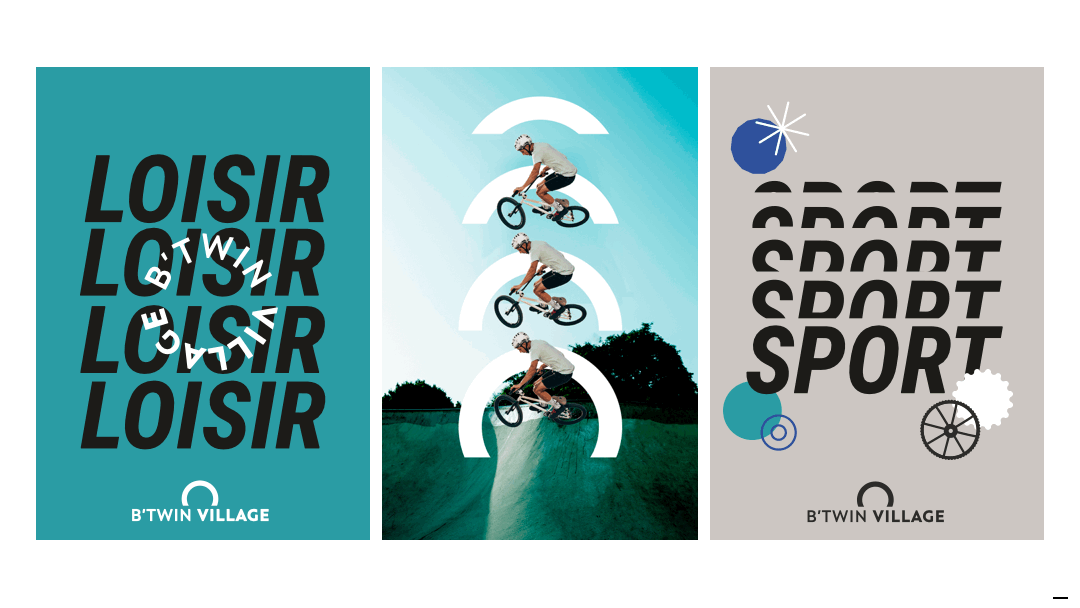
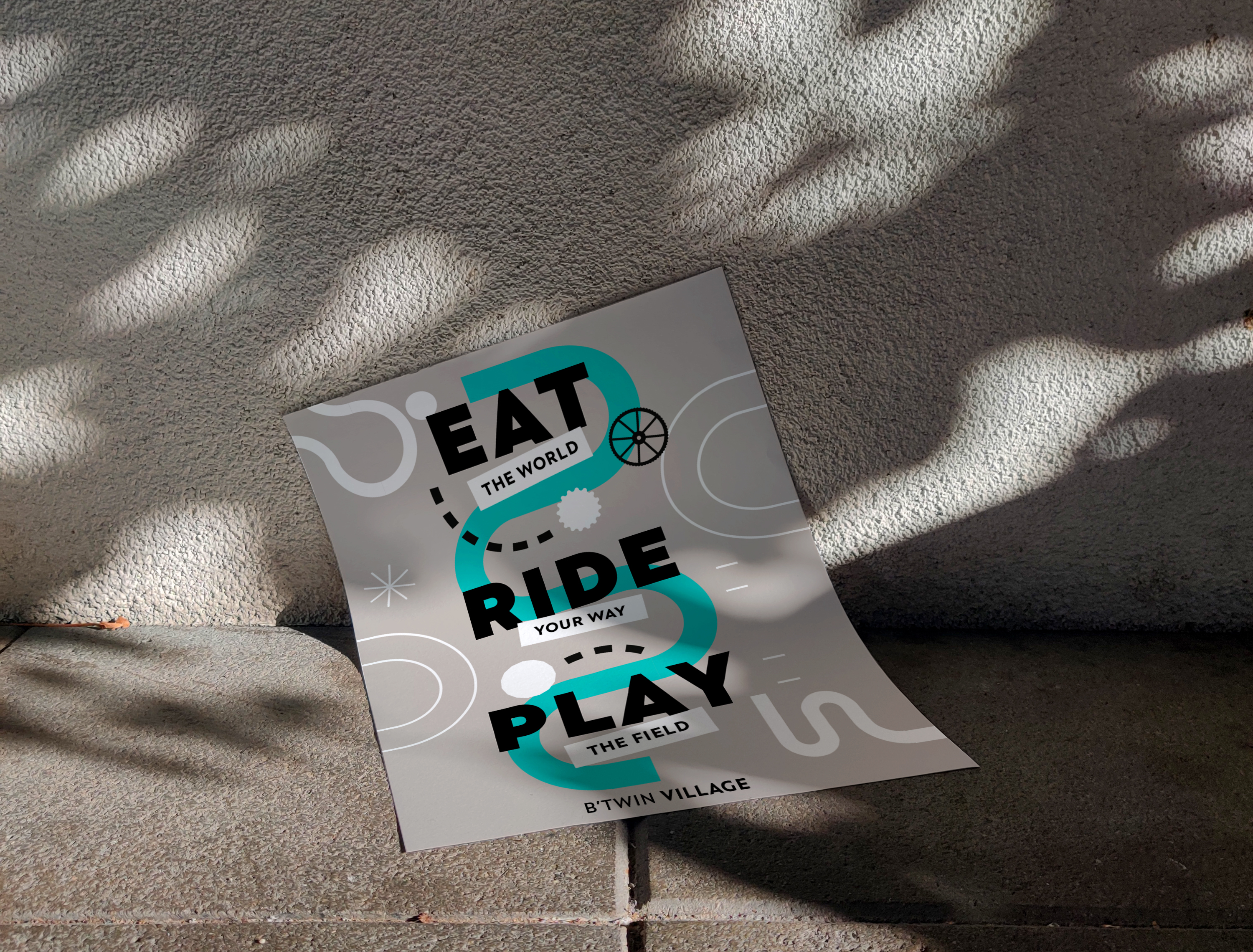
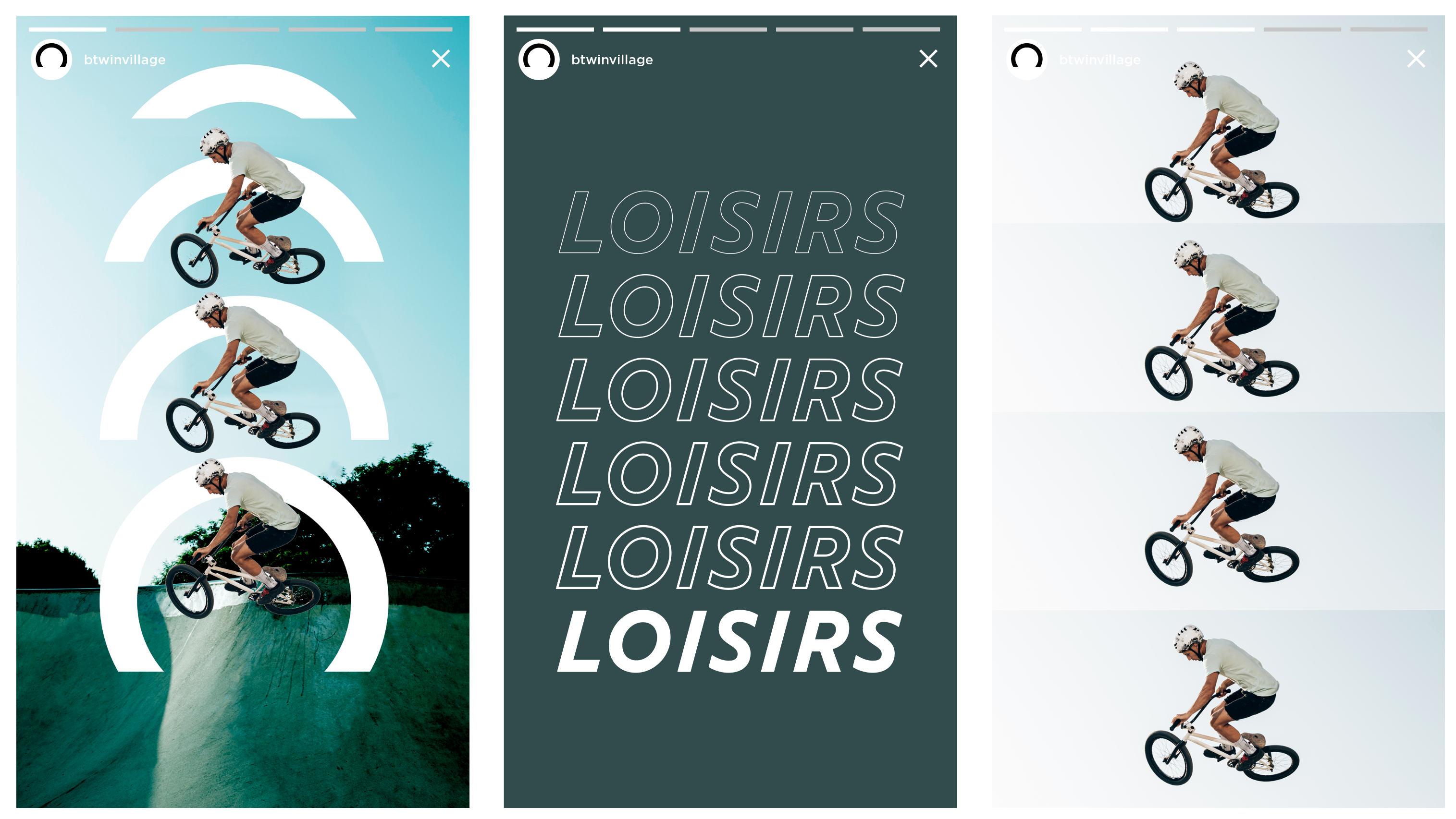
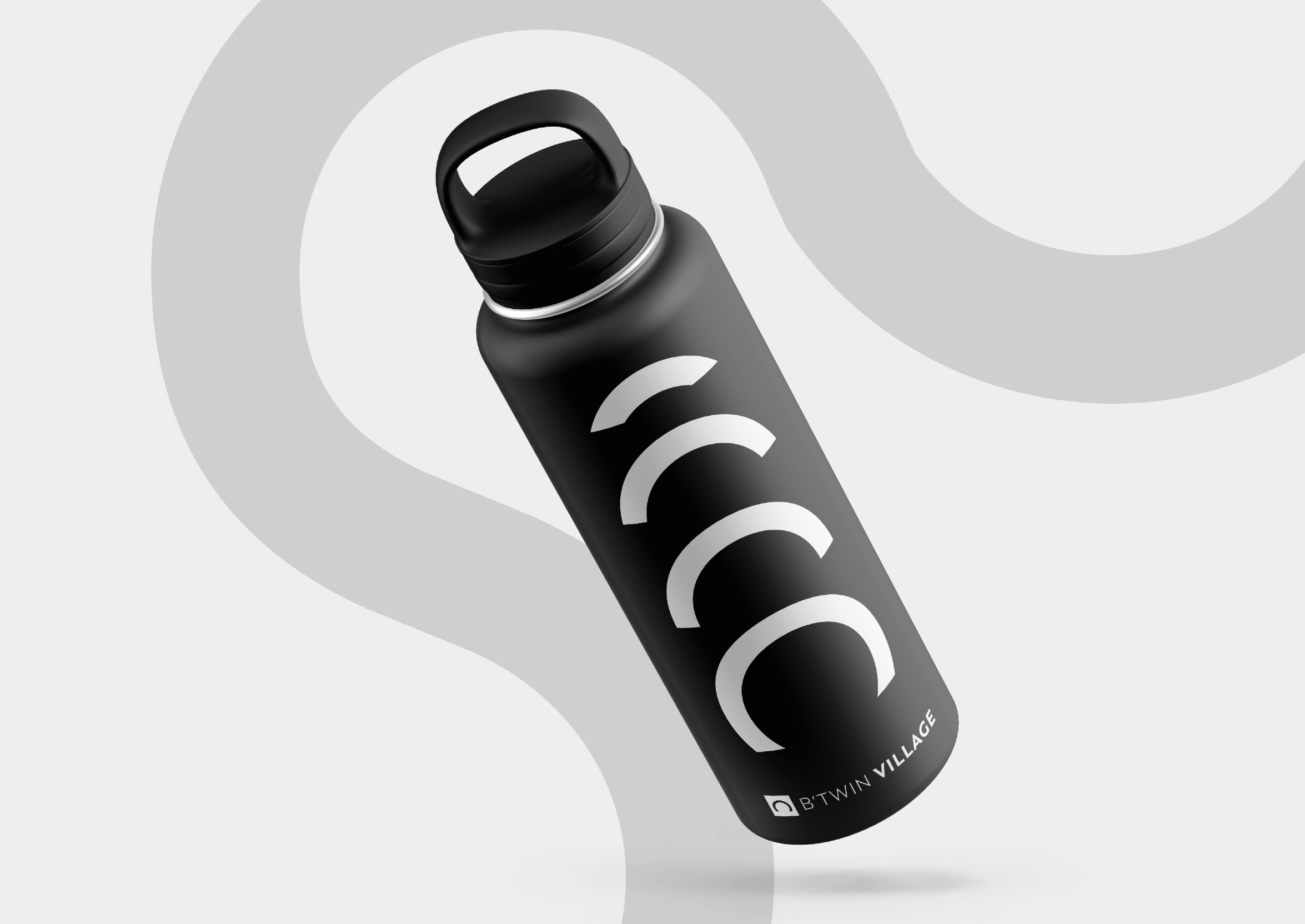
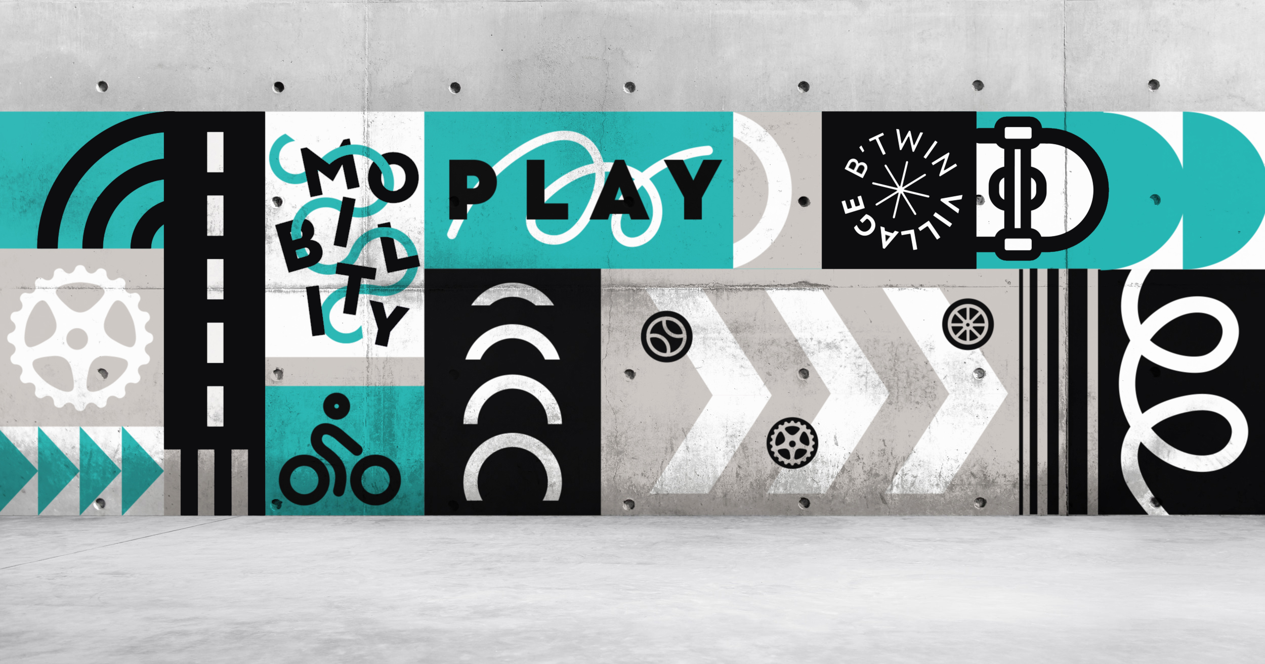
Btwin is a place of urban mobility,
the idea was to focus on the symbolism of the wheel, which unites all forms of eco-friendly transportation, echoing the segmented circle at the building’s entrance to facilitate its identification.
To emphasize movement and dynamism, the typography reflects the breakdown of motion. The design is complemented by curves, symbols, and textures that evoke an urban environment.