︎
SO WATT !
SO WATT !
Visual identity for
SO WATT ! - Creative hub
Lille/2025
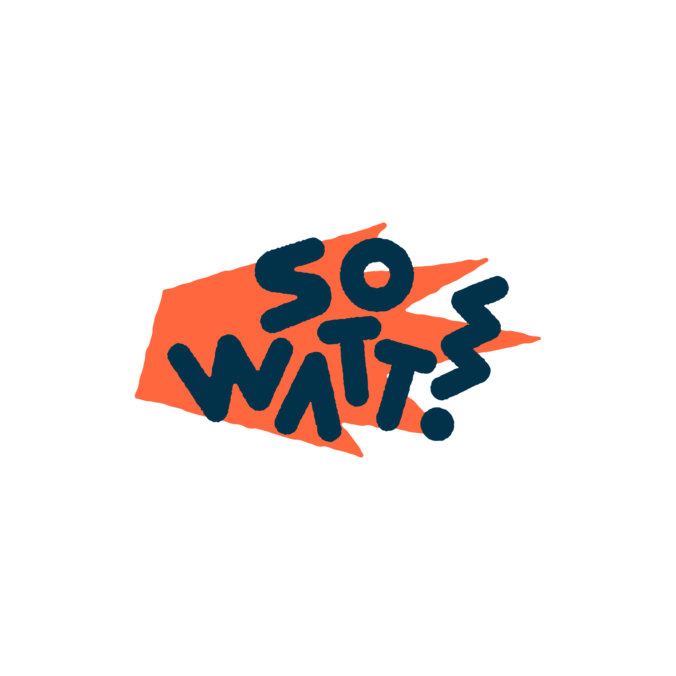
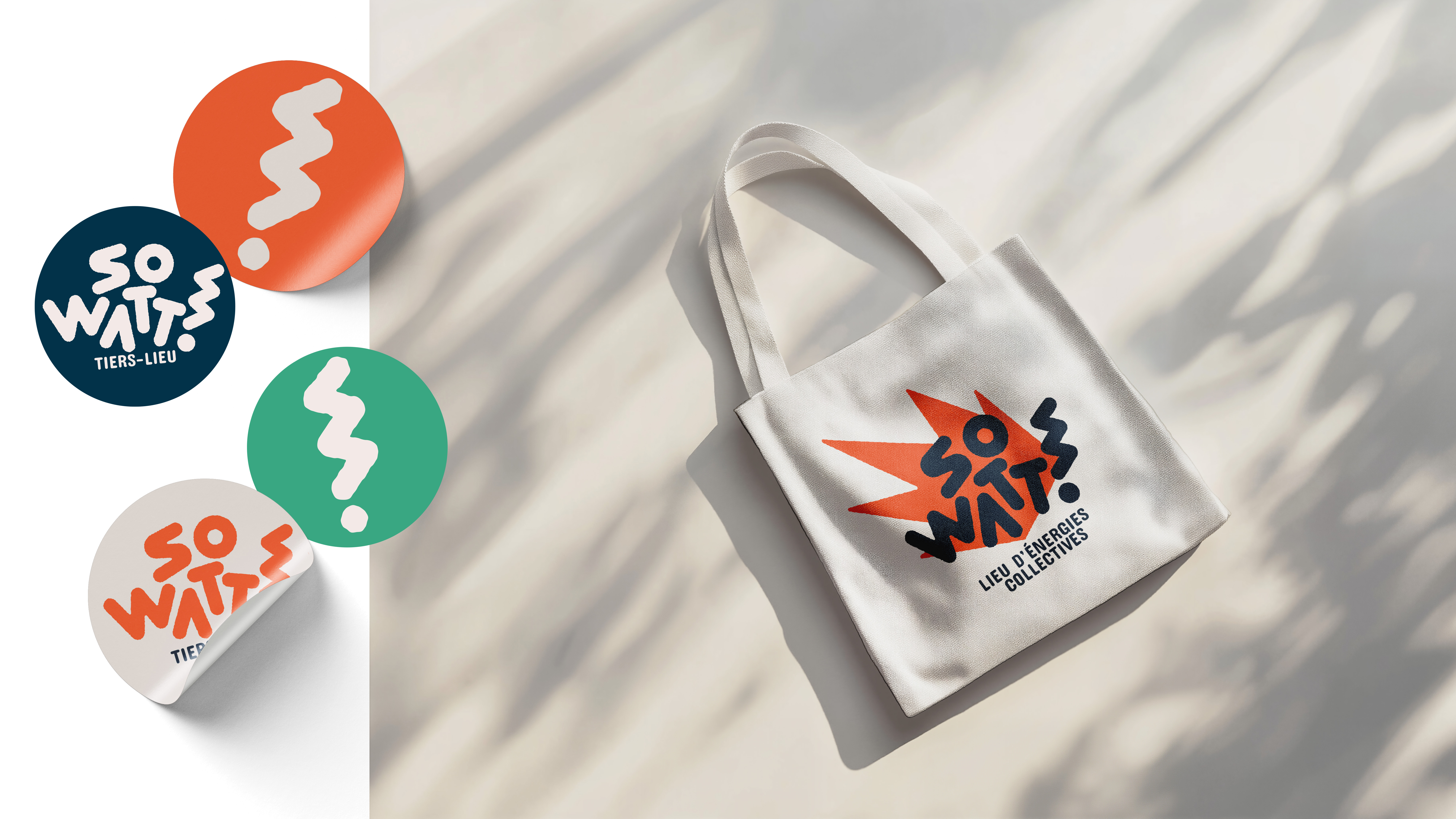
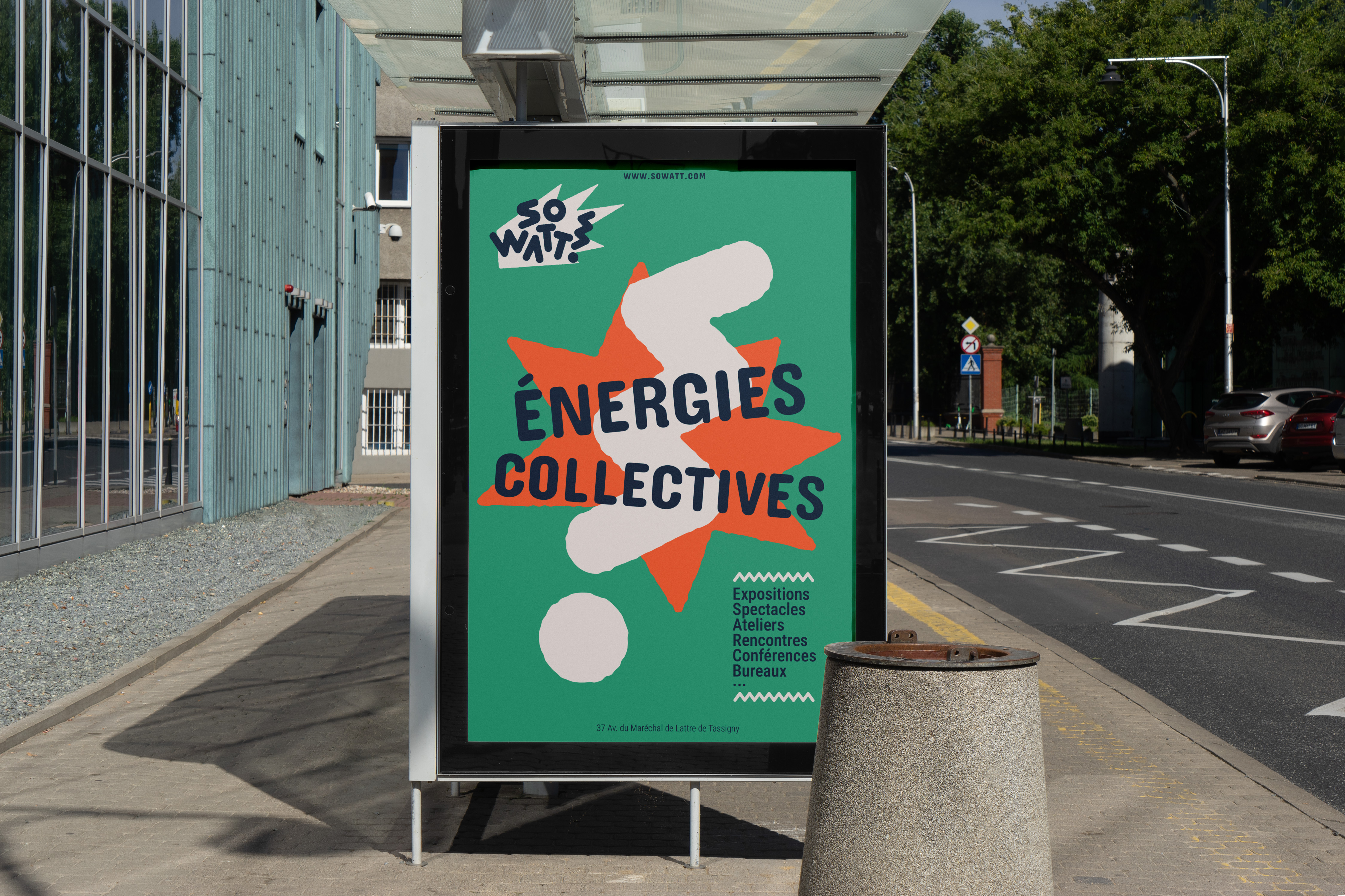
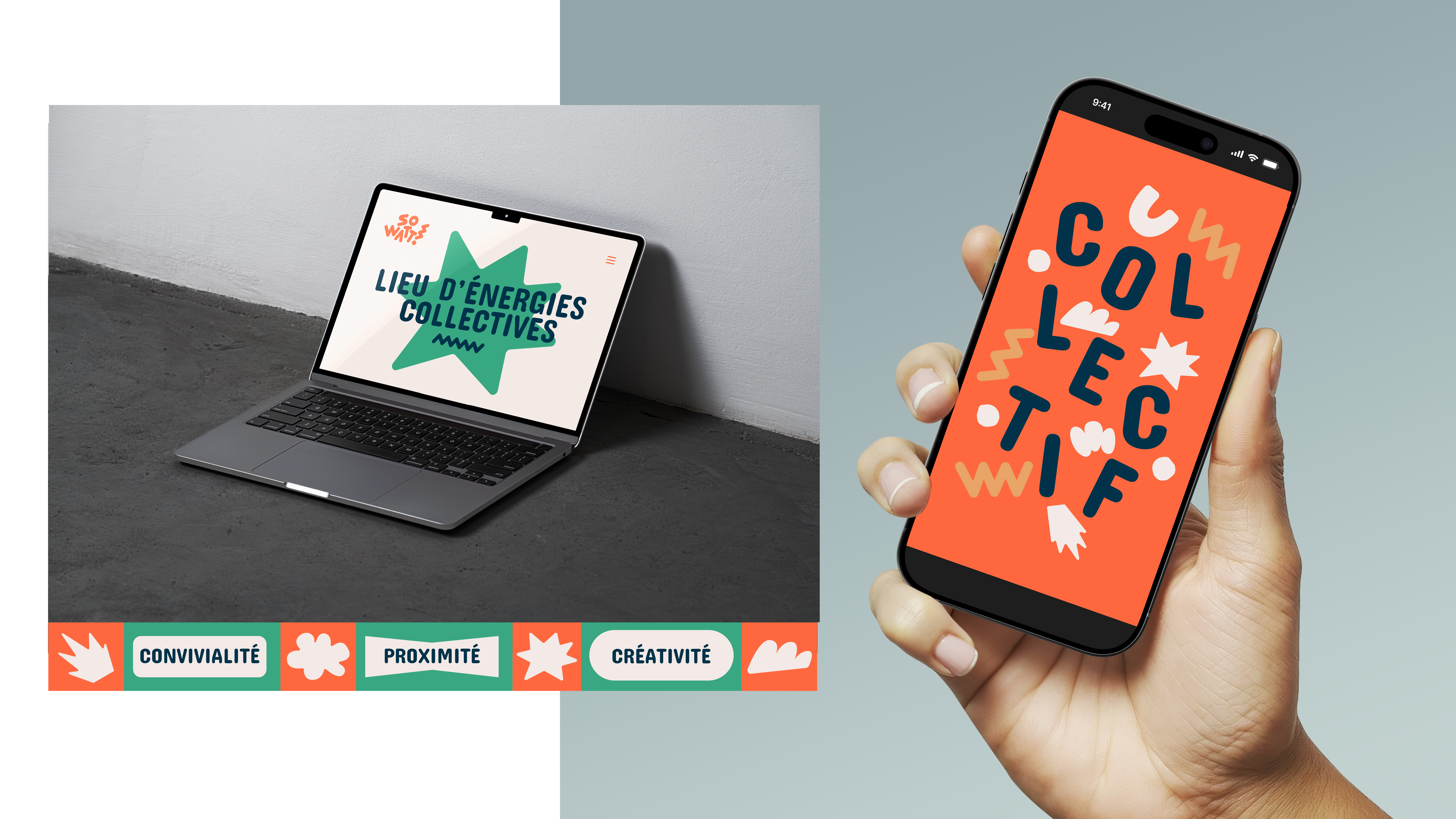
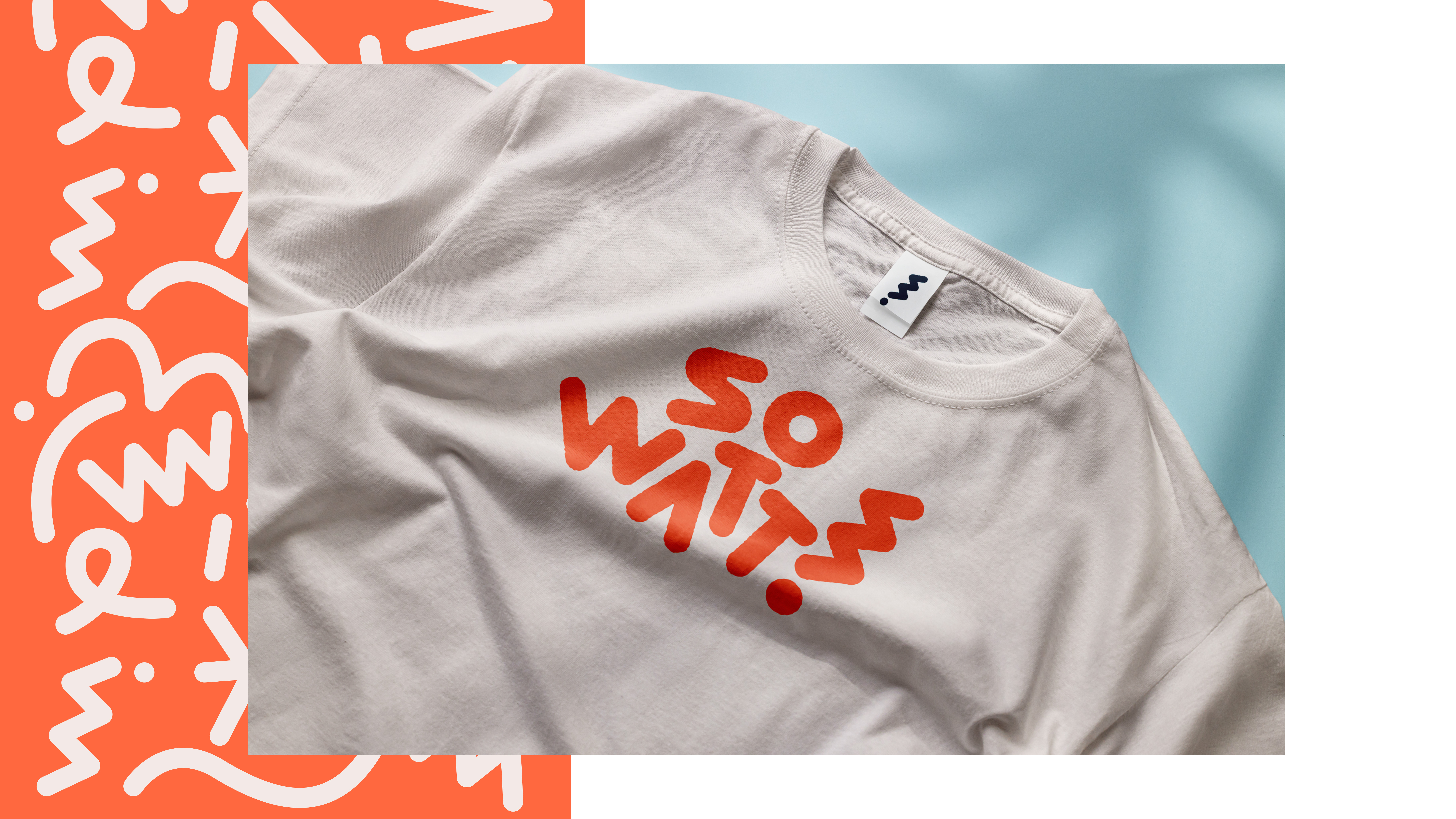
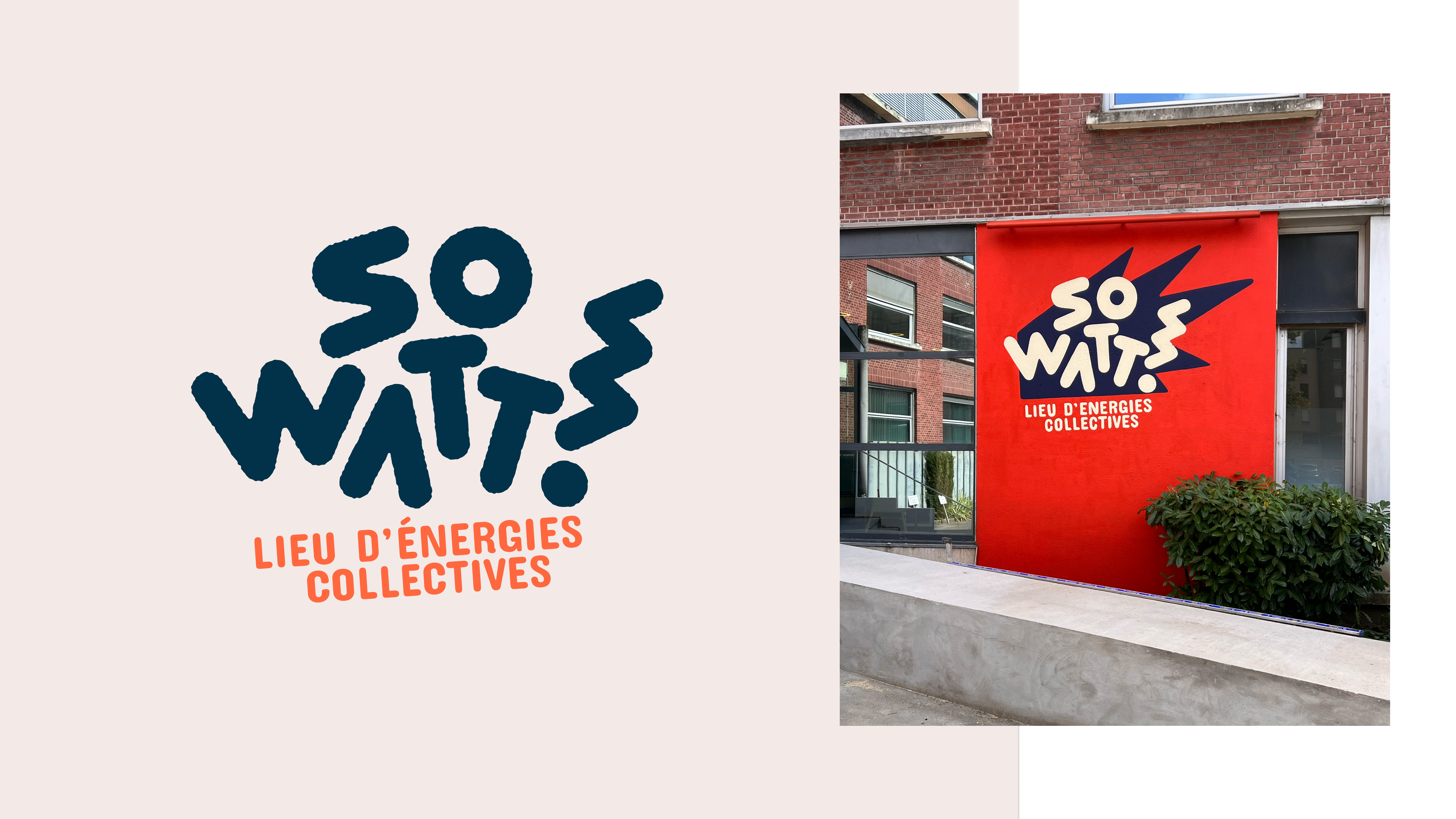
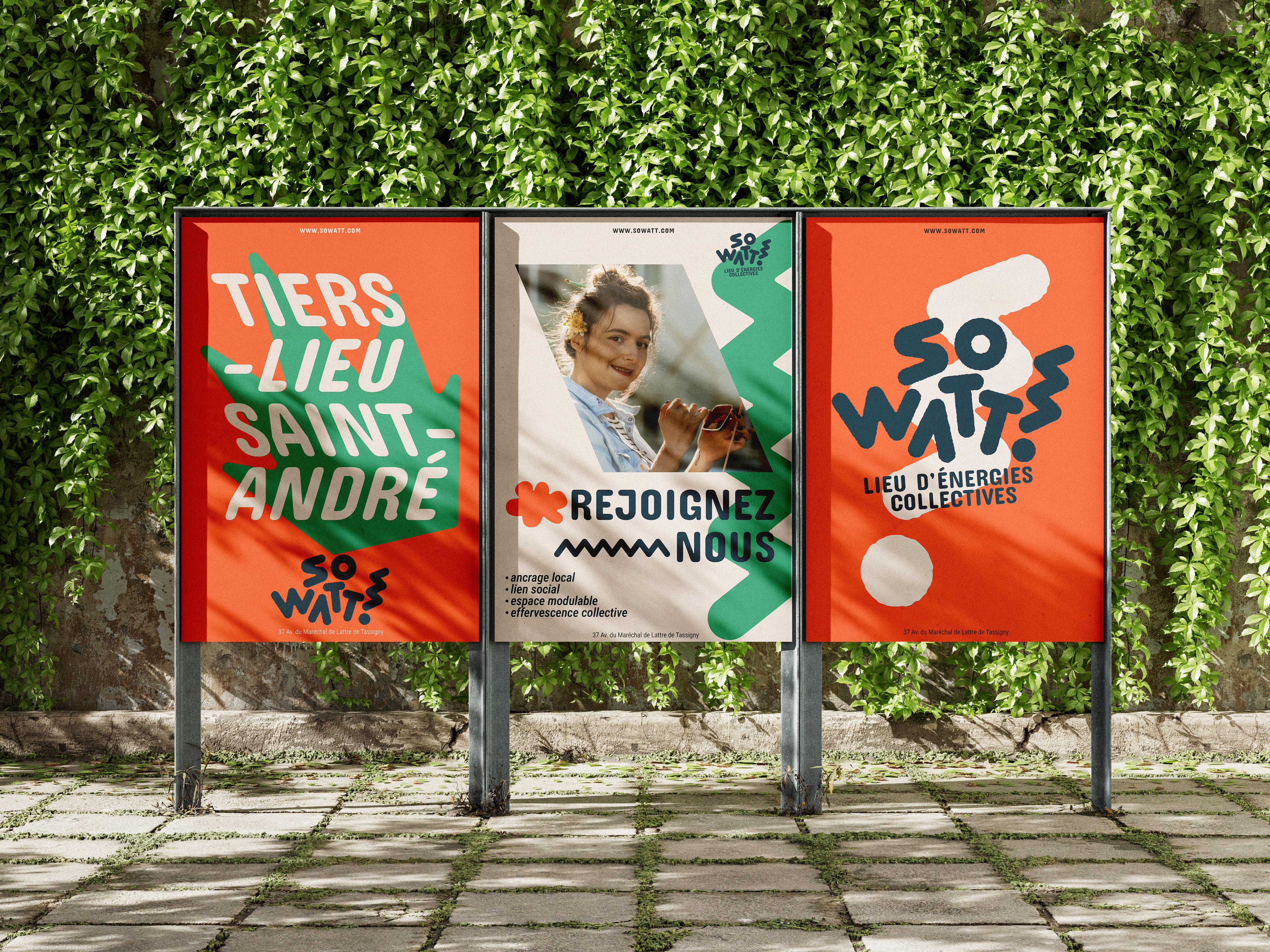
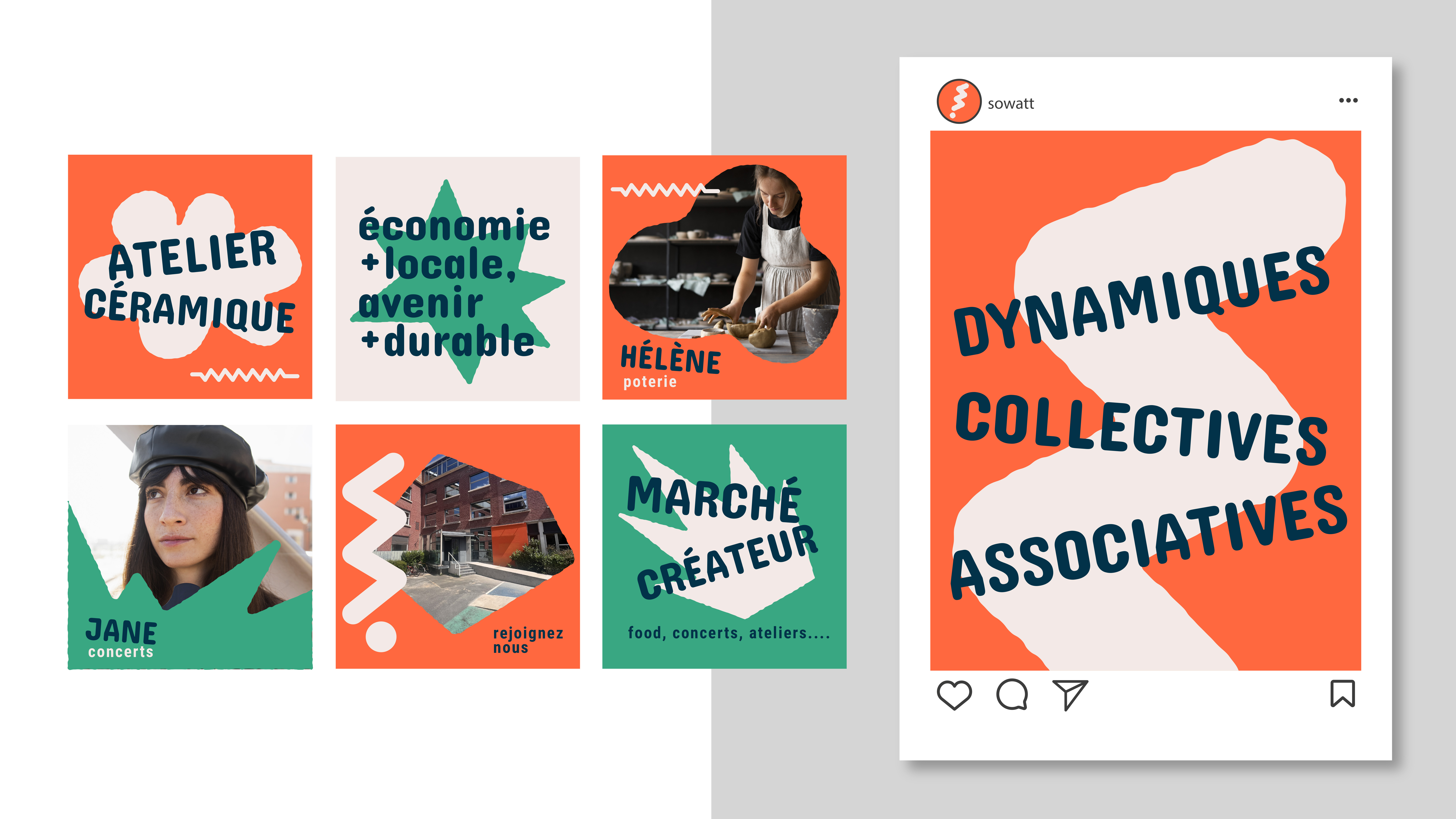
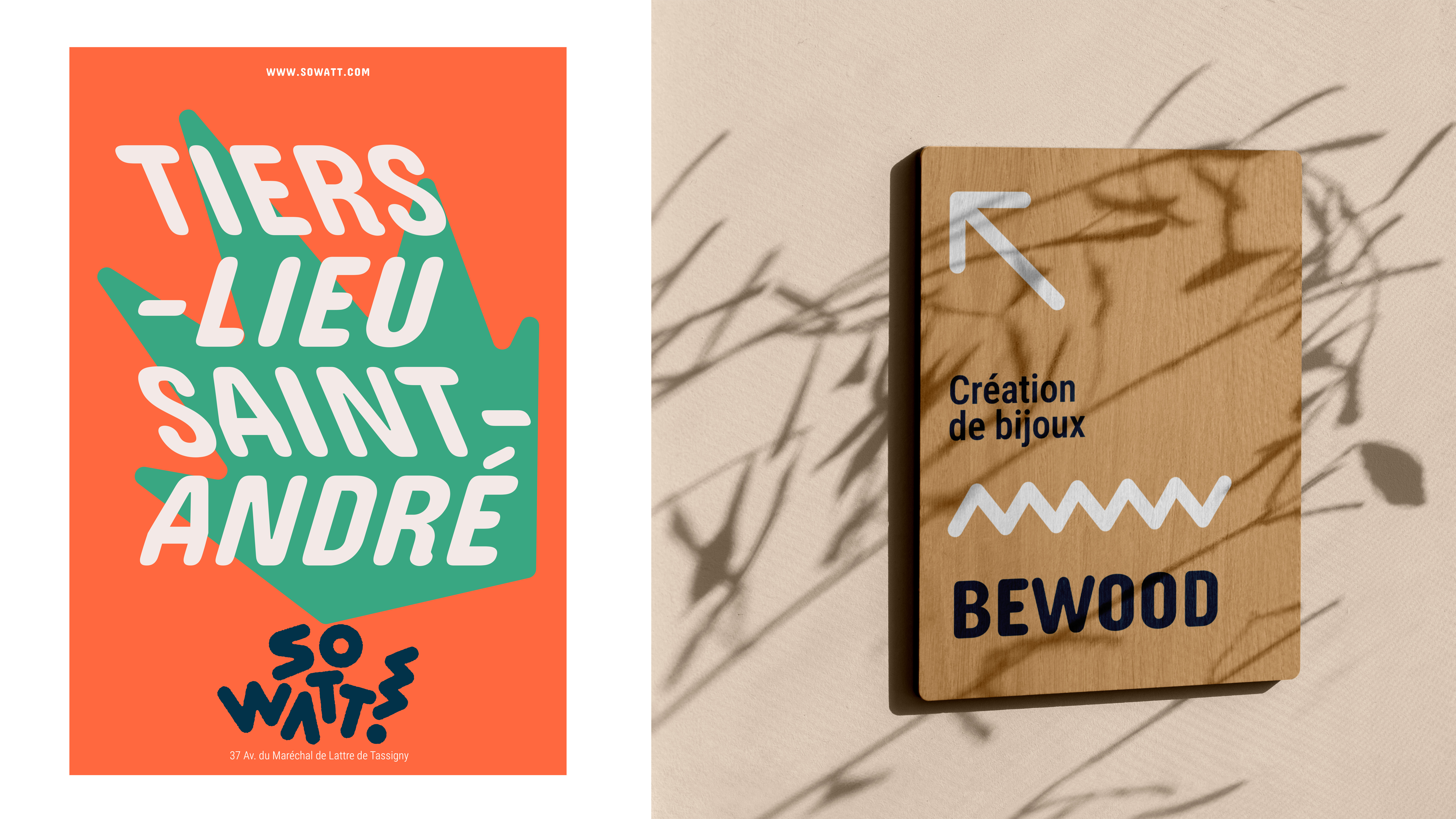
Housed in the former premises of DALKIA, an energy services company, this cretive hub embodies a fresh, forward-looking spirit.
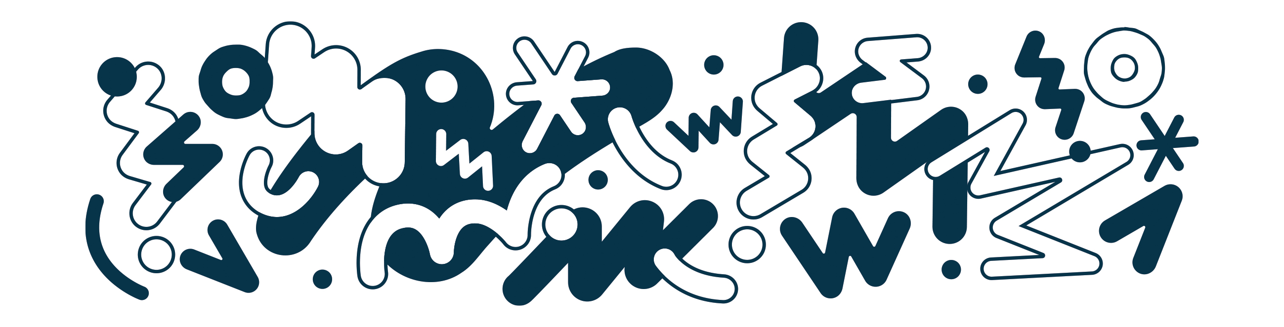
Its visual identity captures the site’s vitality through bold geometric forms and vibrant colors, while a spring-like accordion motif woven into the typography reinforces the idea of energy, movement, and constant renewal.
Housed in the former premises of DALKIA, an energy services company, this cretive hub embodies a fresh, forward-looking spirit.
Its visual identity captures the site’s vitality through bold geometric forms and vibrant colors, while a spring-like accordion motif woven into the typography reinforces the idea of energy, movement, and constant renewal.