︎
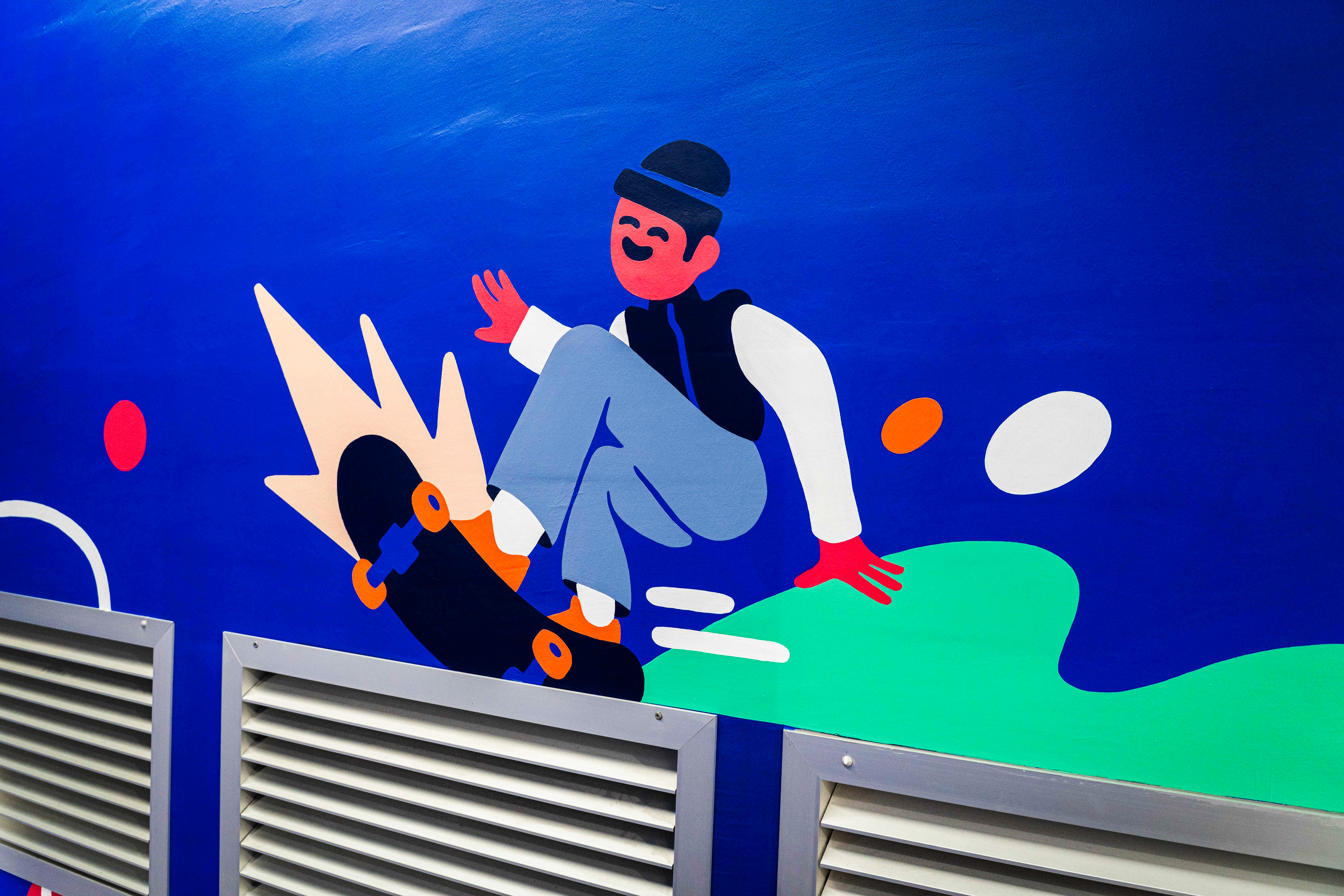
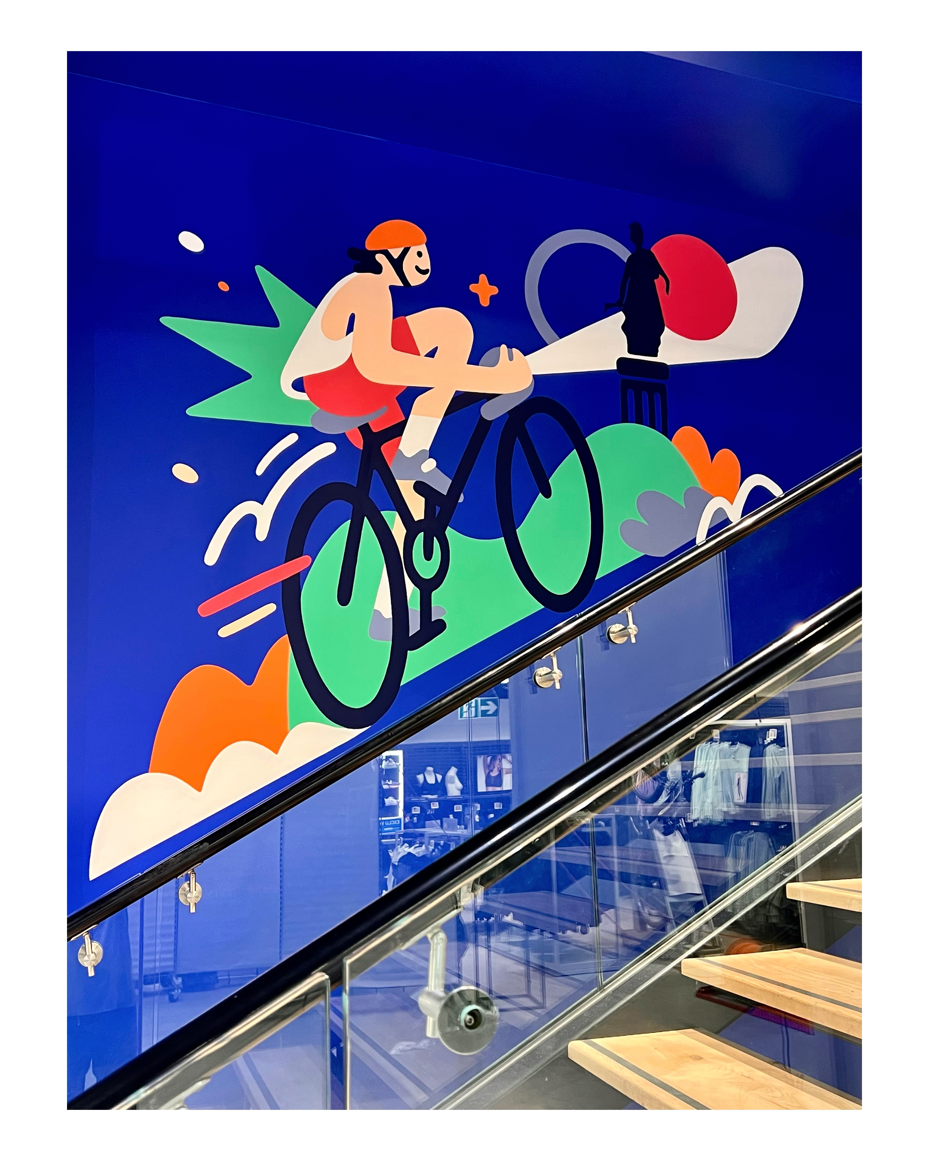
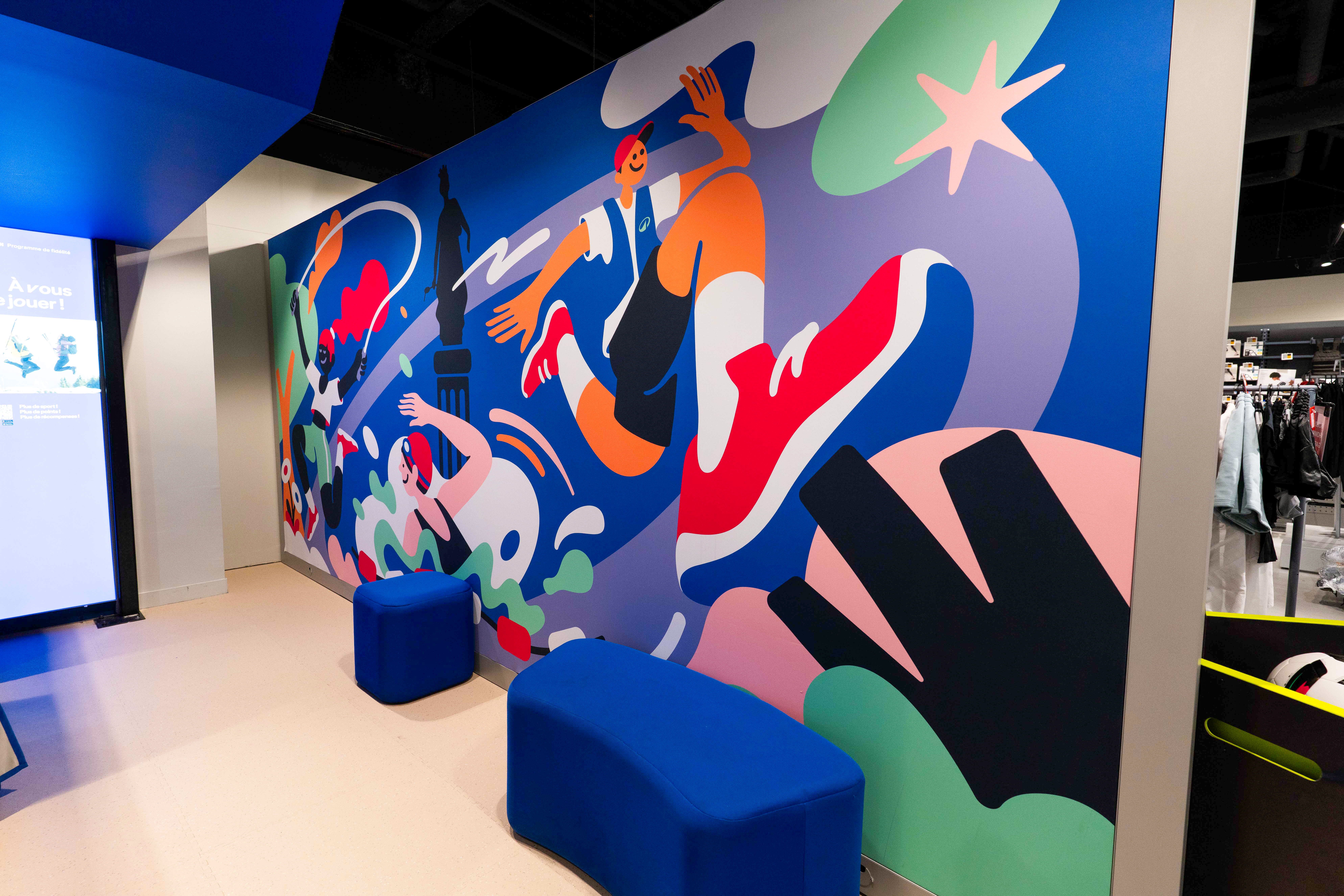

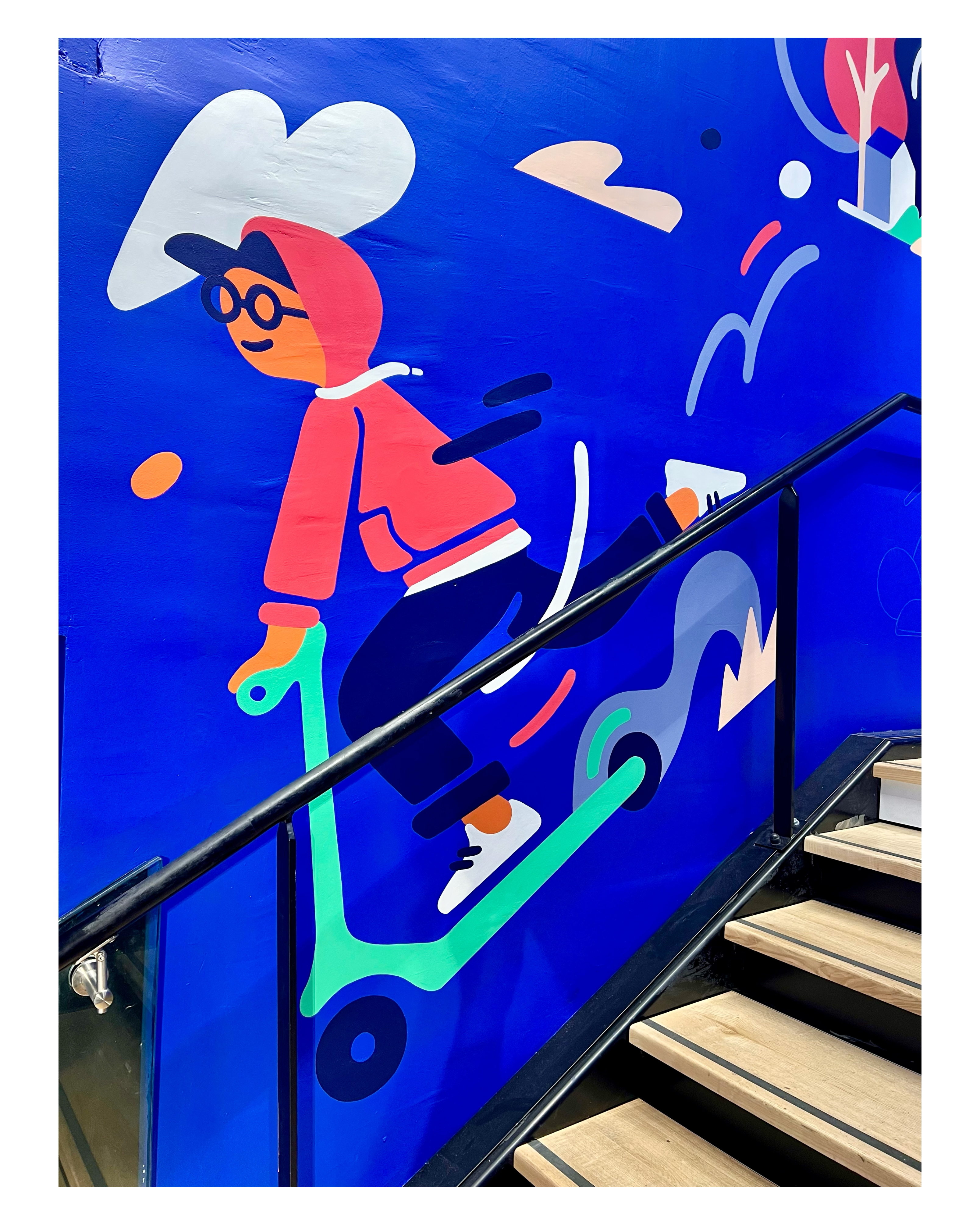
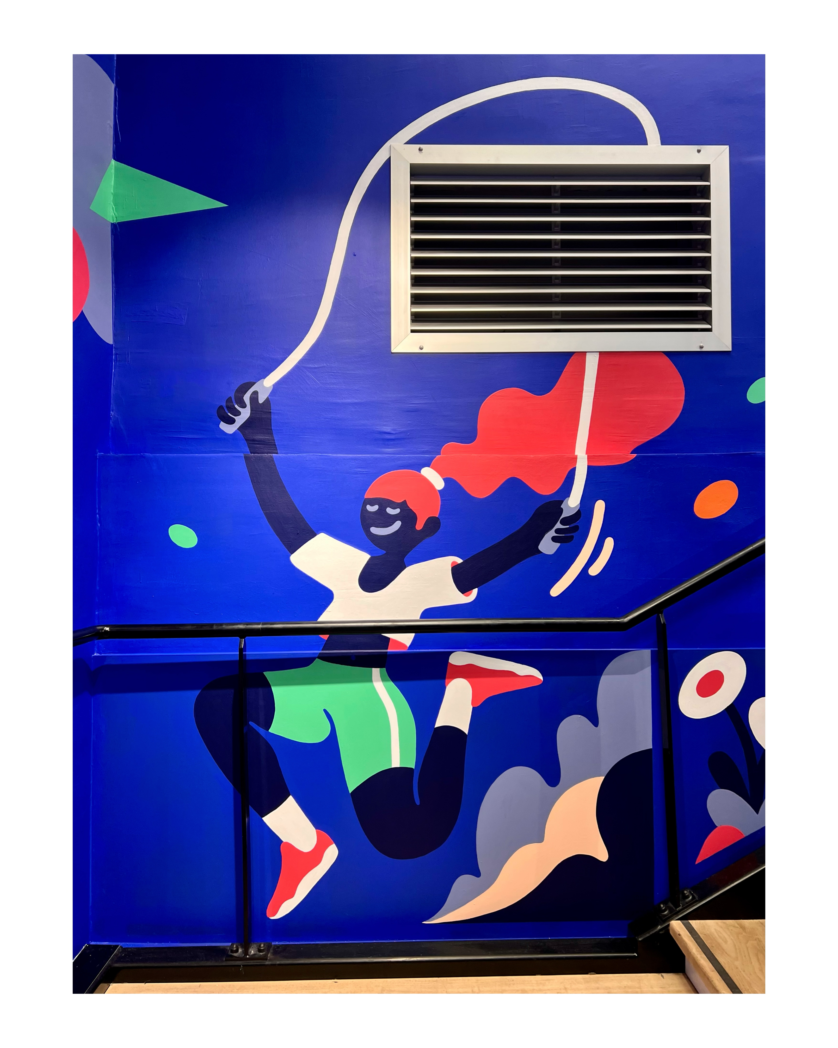
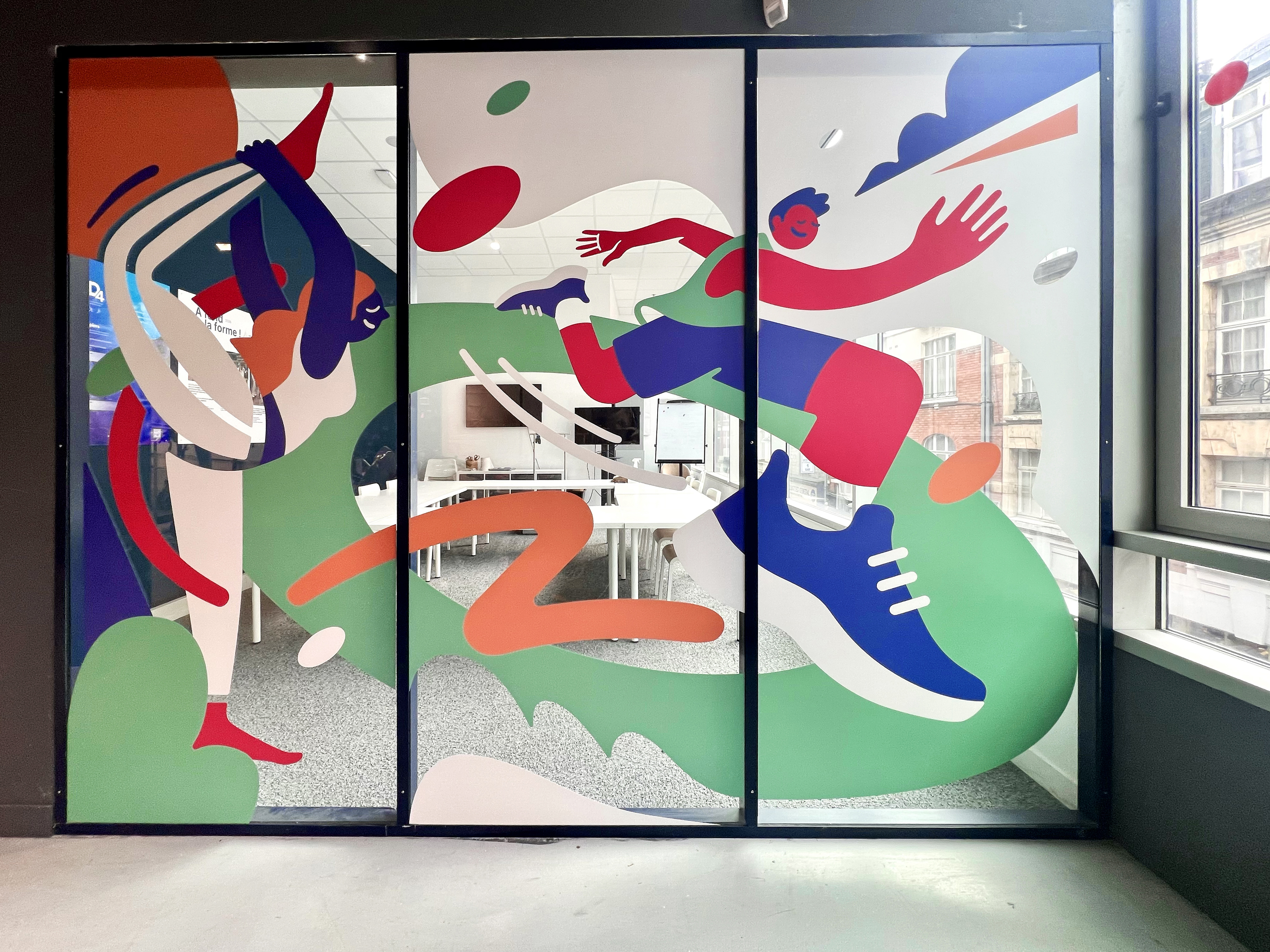
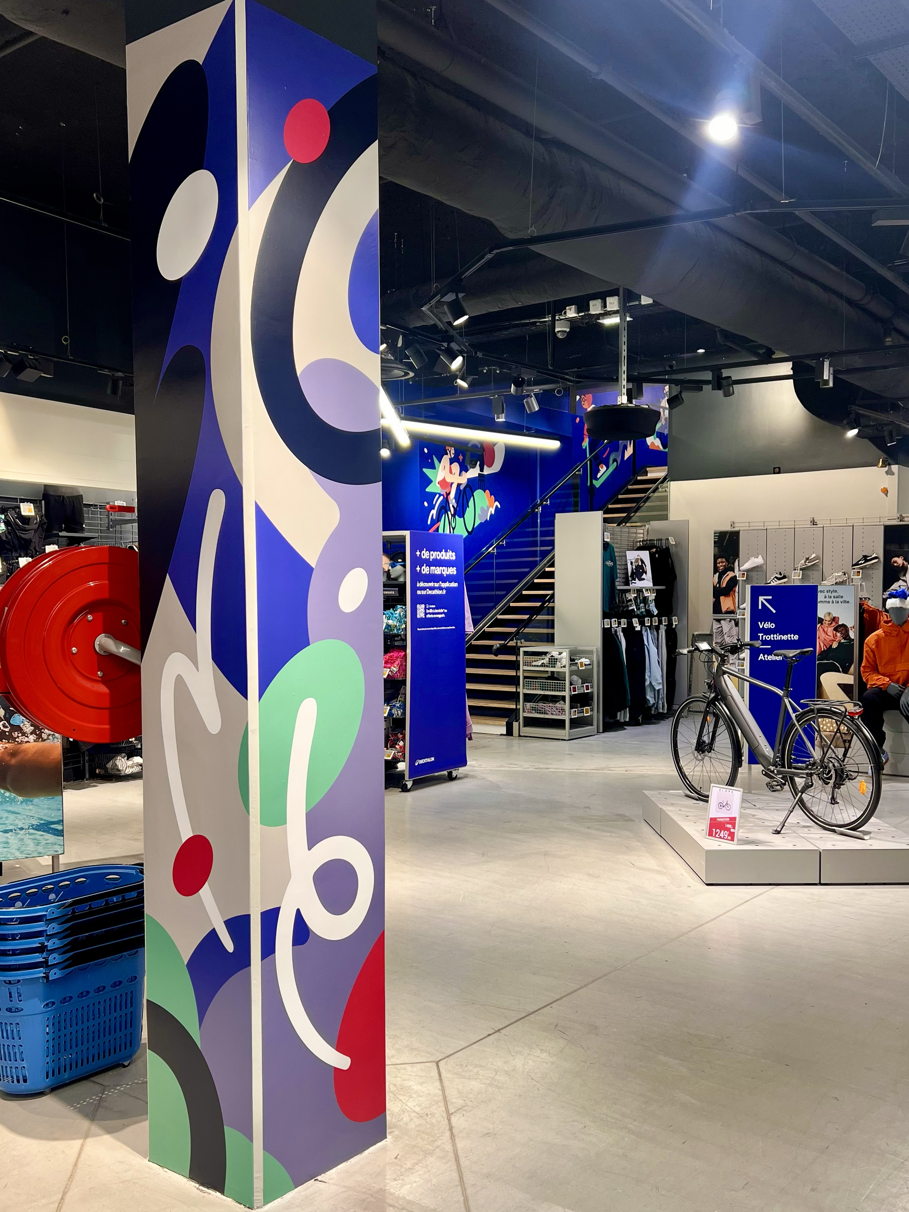
DECAT CITY LILLE
DECAT CITY LILLE
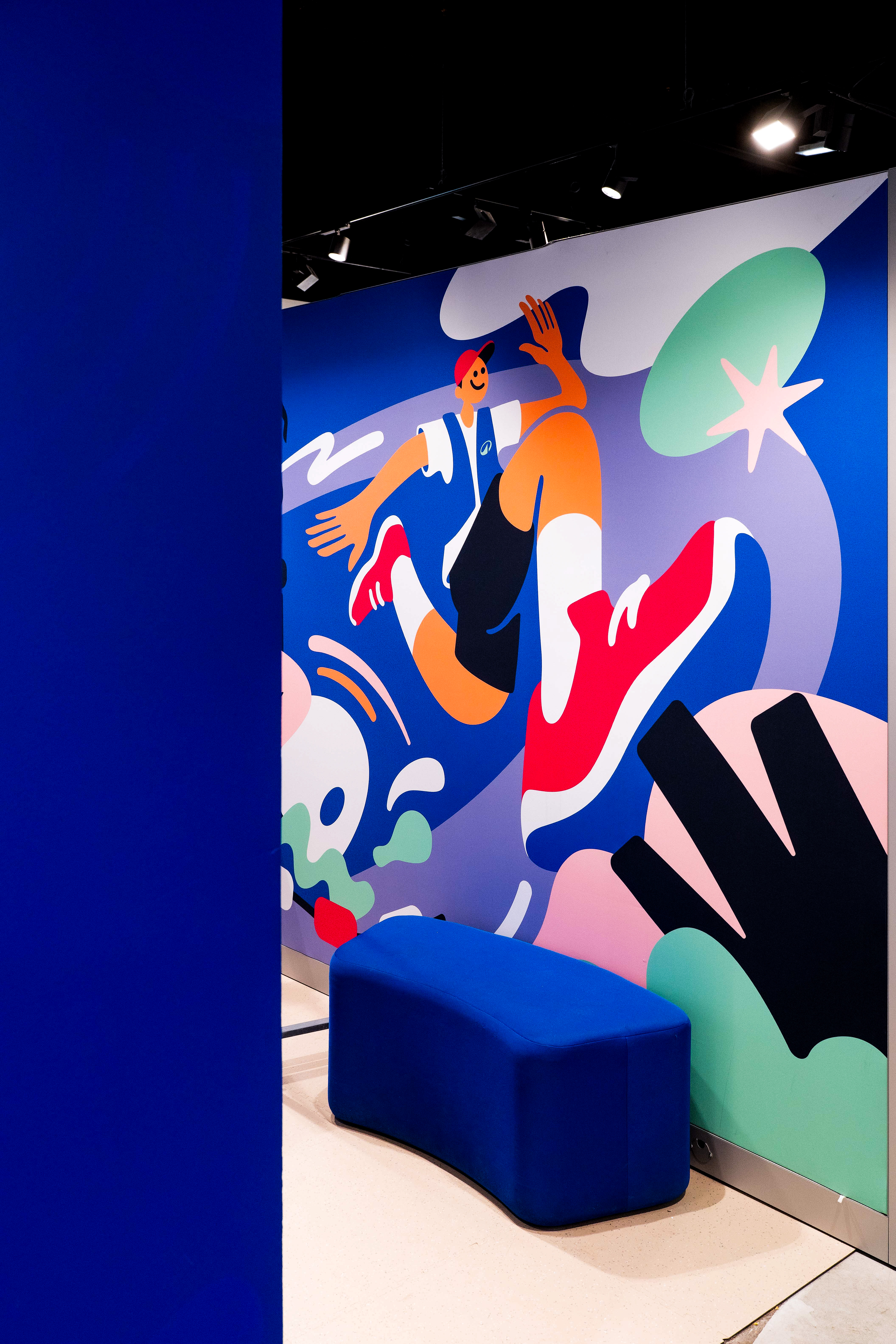
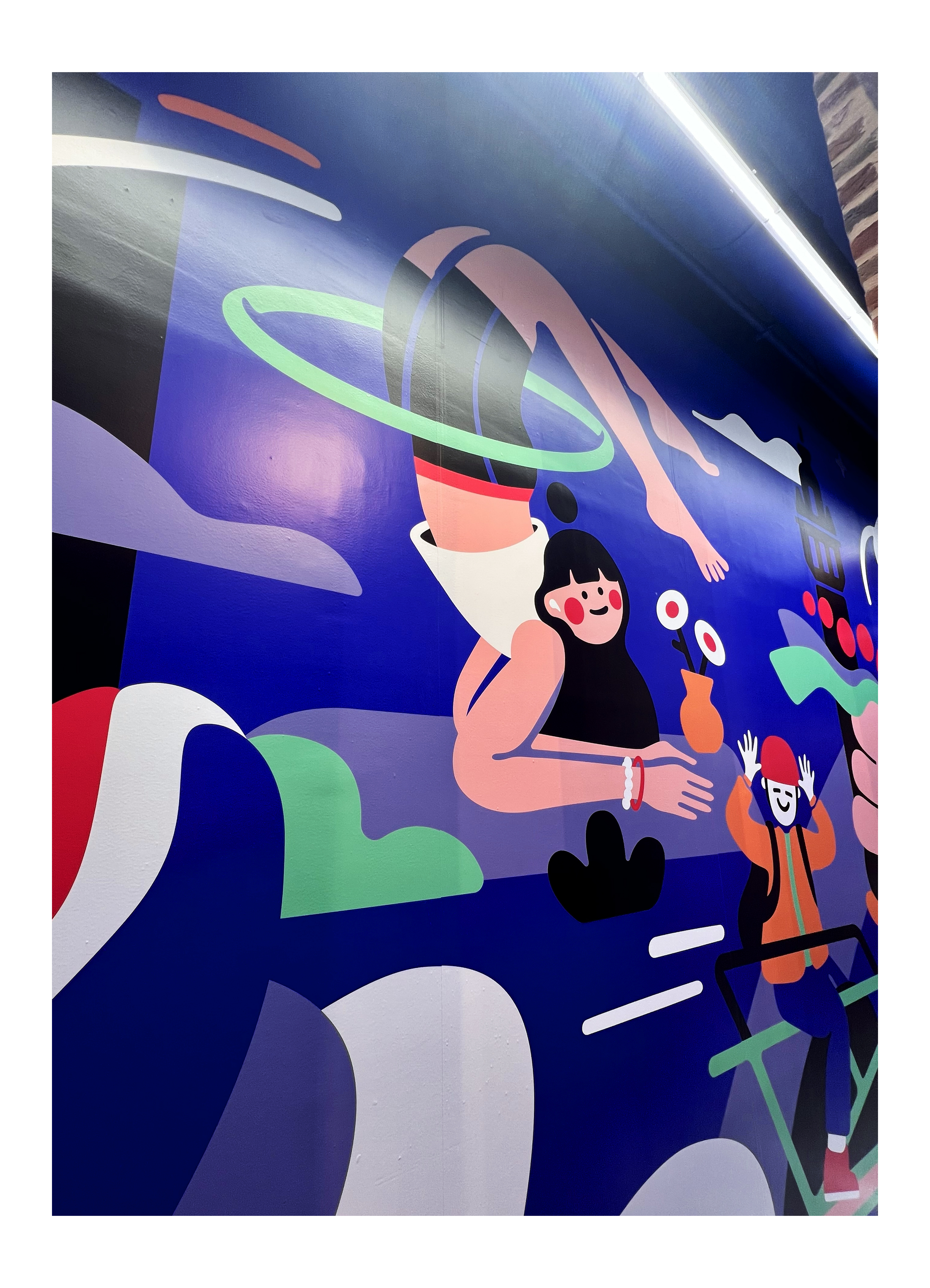
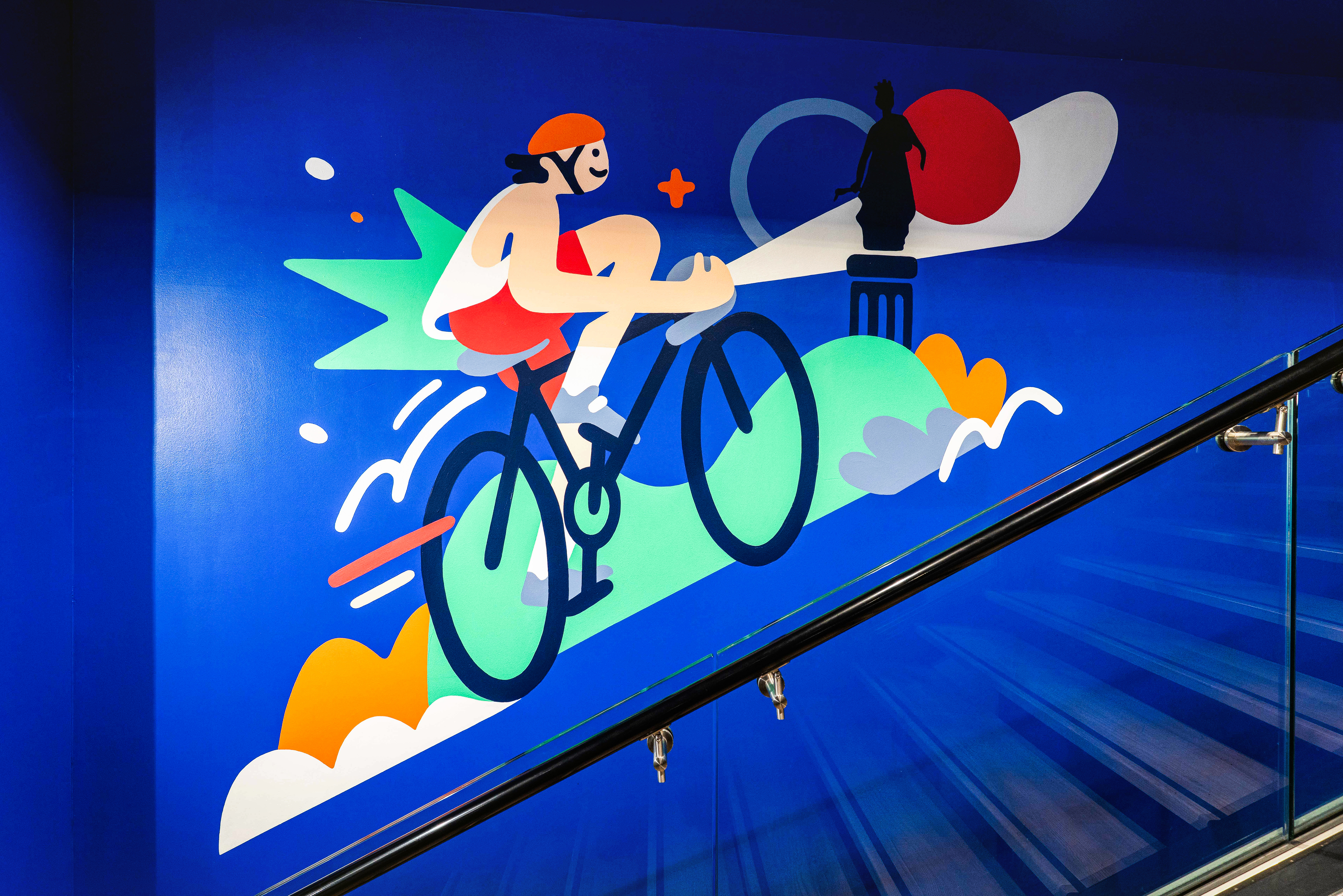
Mural painting
& interior identity design
for Decathlon City
Lille/2025




︎
DRACHE
DRACHE
Visual identity for
Drache production
Lille/2026


This visual identity is built around a typographic approach featuring fluid, highly condensed letterforms, evoking both the idea of a puddle and a sense of community. A subtle droplet shape can be found within the negative space of the “A.”
The grain texture recalls cinematic aesthetics while also evoking rain and the distinctive textures of Northern landscapes.


︎
TRIPLEX
TRIPLEX
Mural created for le triplex
coworking space and 404 ventures startup hub
Lille/2026


︎
MARC & CECILE
Branding and mural painting for
designer optician Marc & Cécile
Cambrai/2025


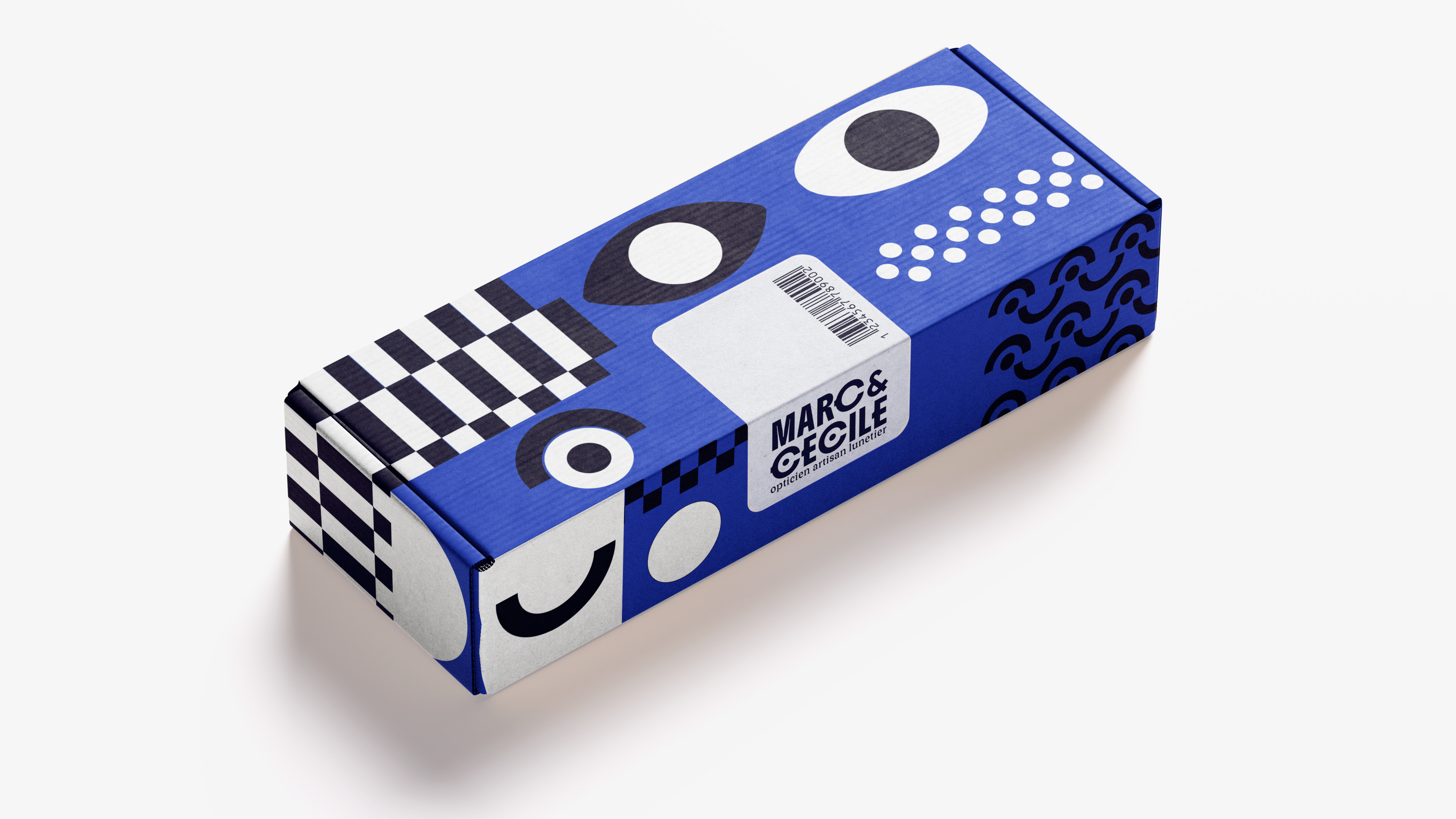
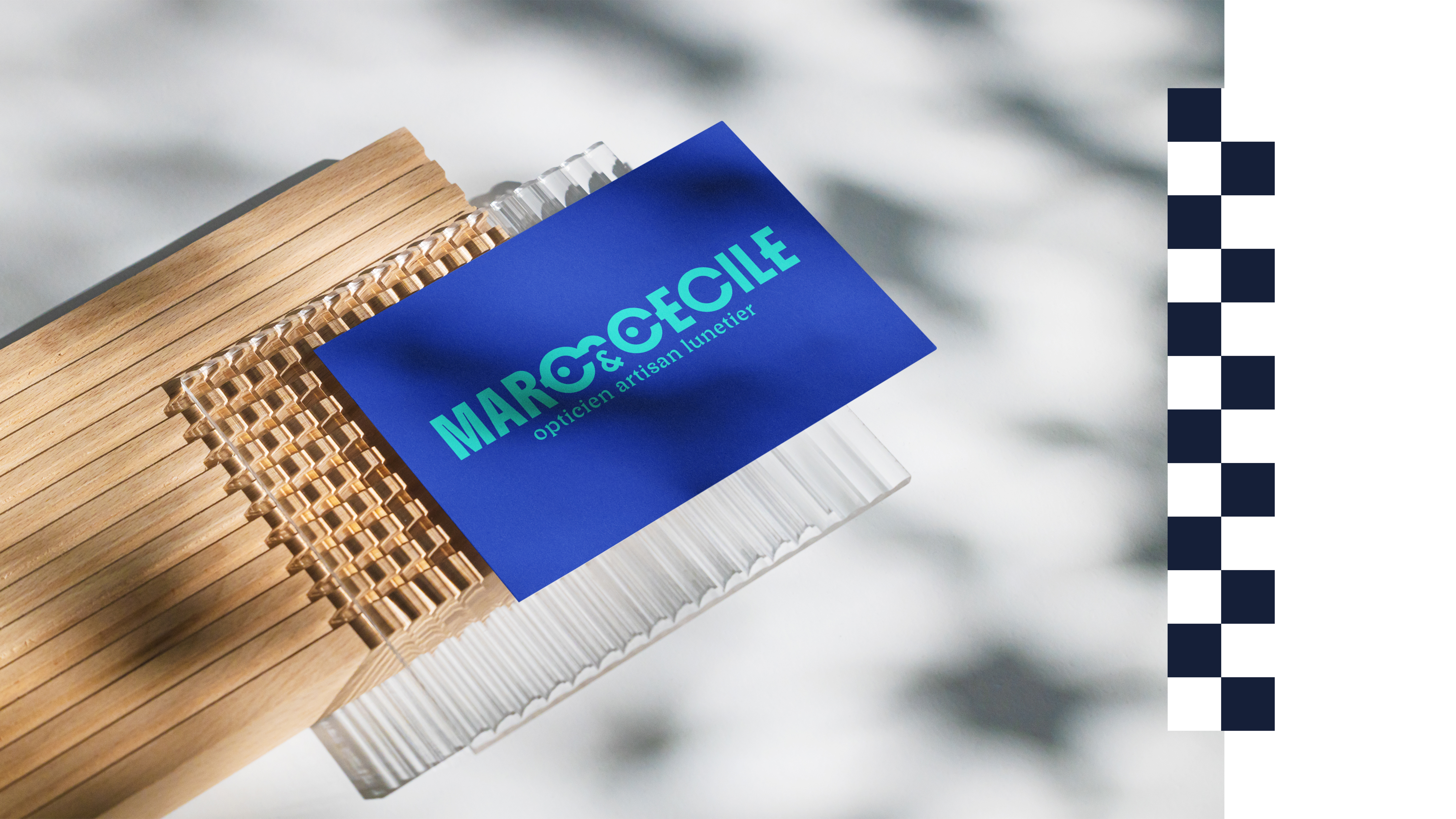
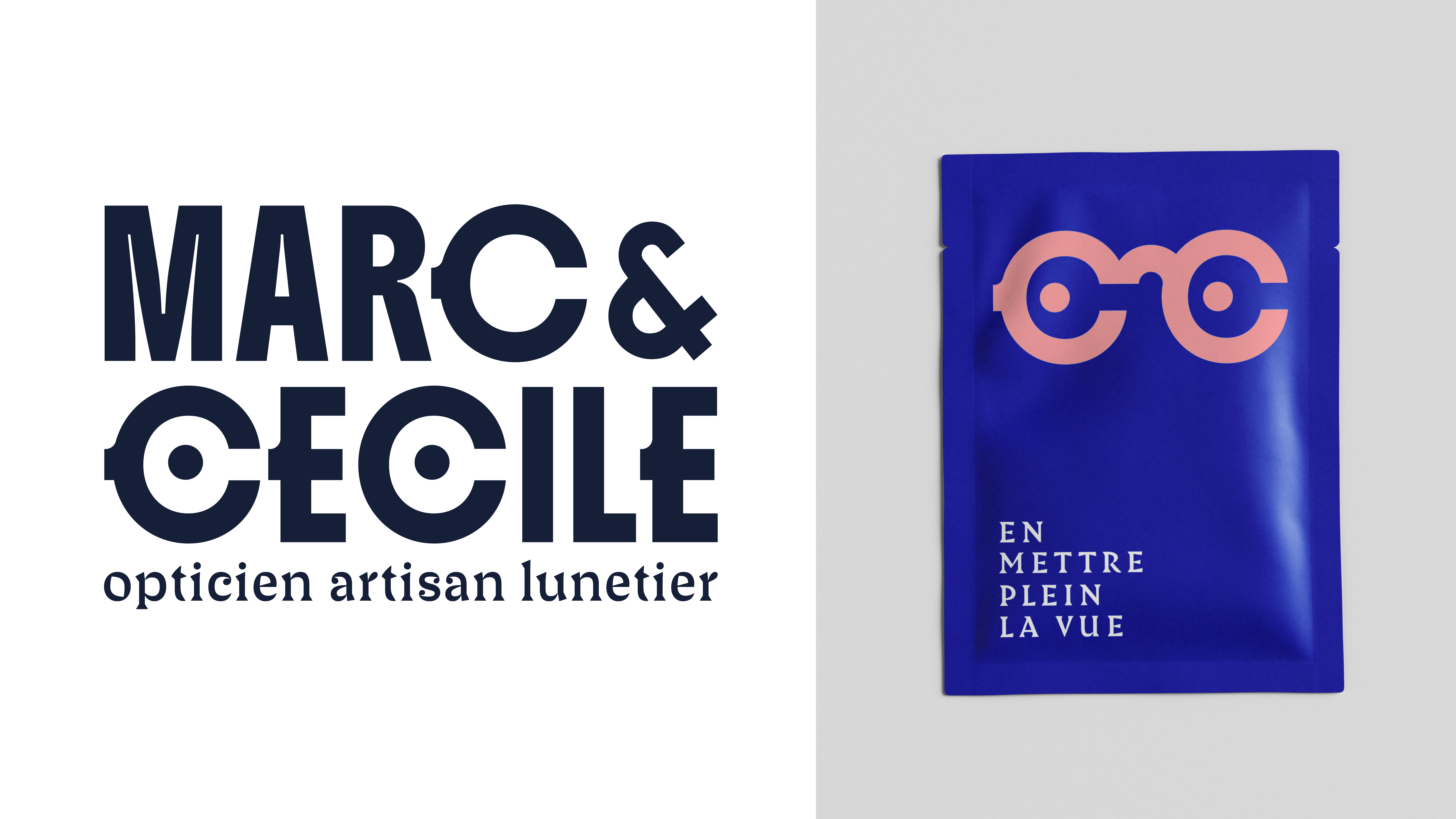
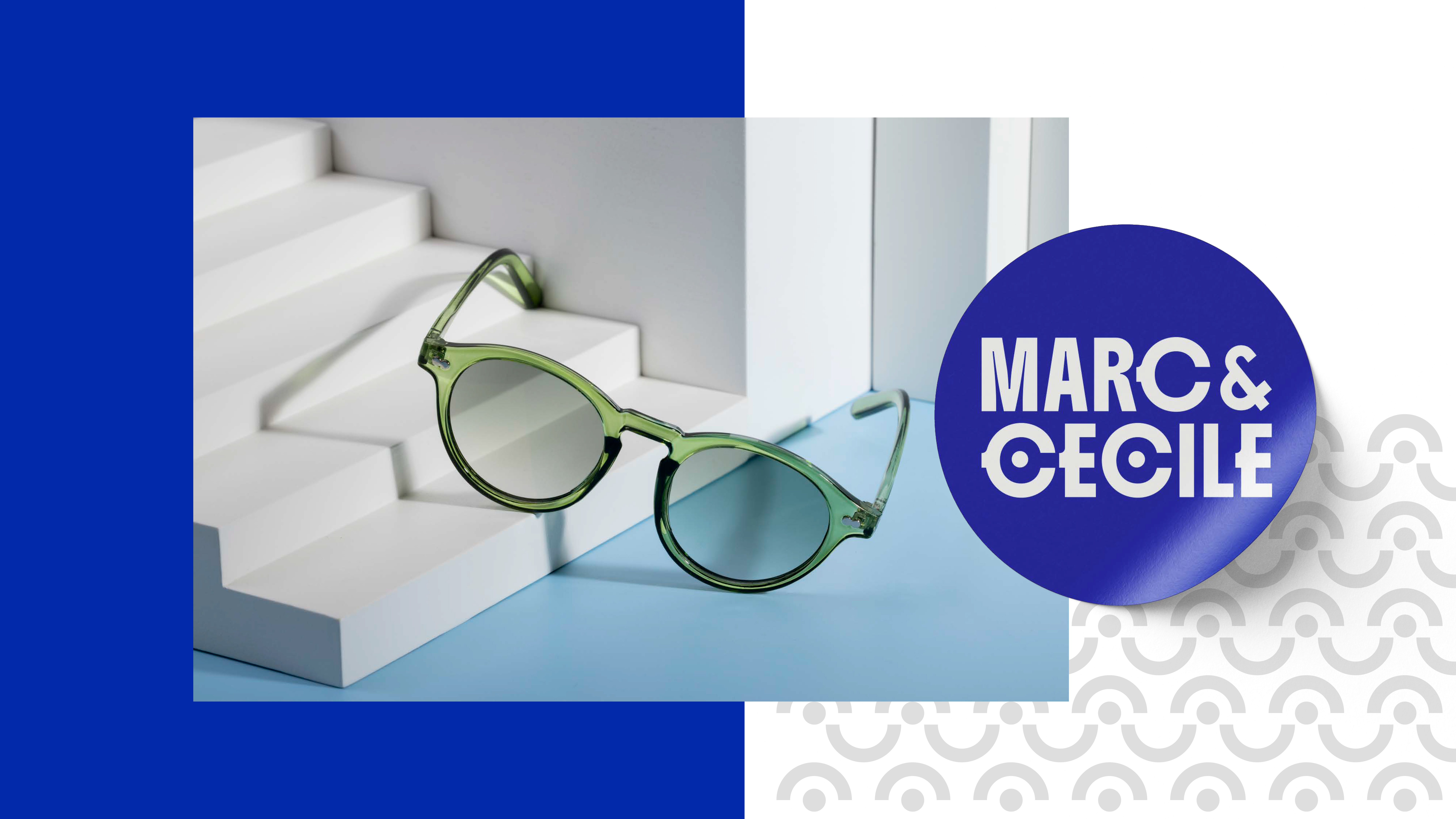
For this duo of opticians and eyewear designers, the idea was to symbolize a pair of glasses through the letter C, while the temple of the frame is subtly integrated into the letter E.
The overall visual identity plays with the eye motif, drawing inspiration from the Memphis aesthetic.
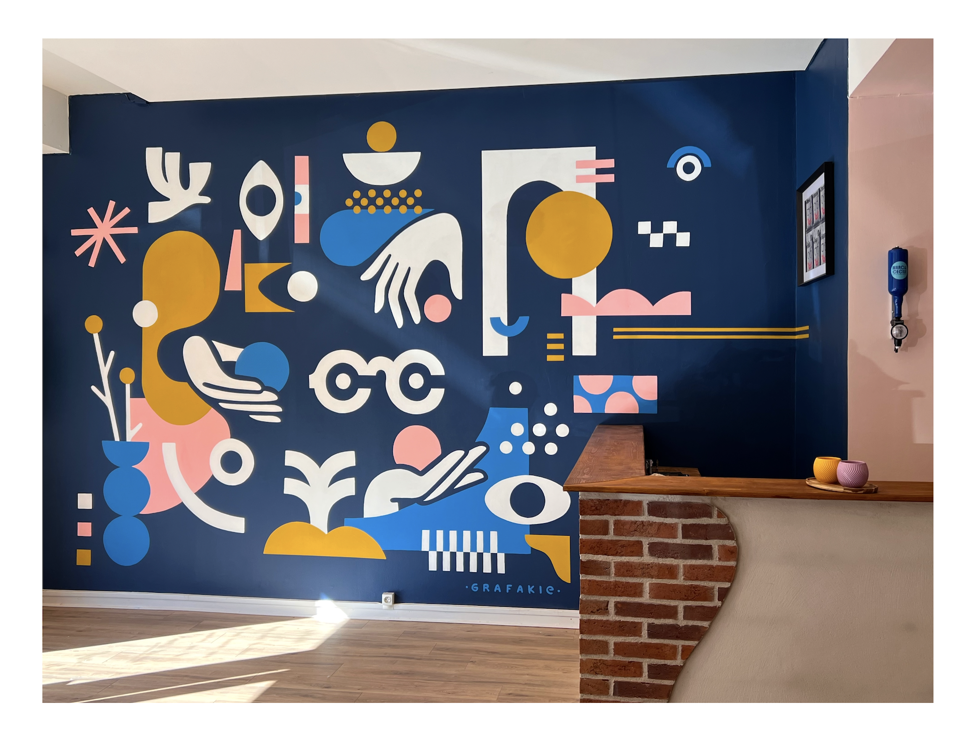
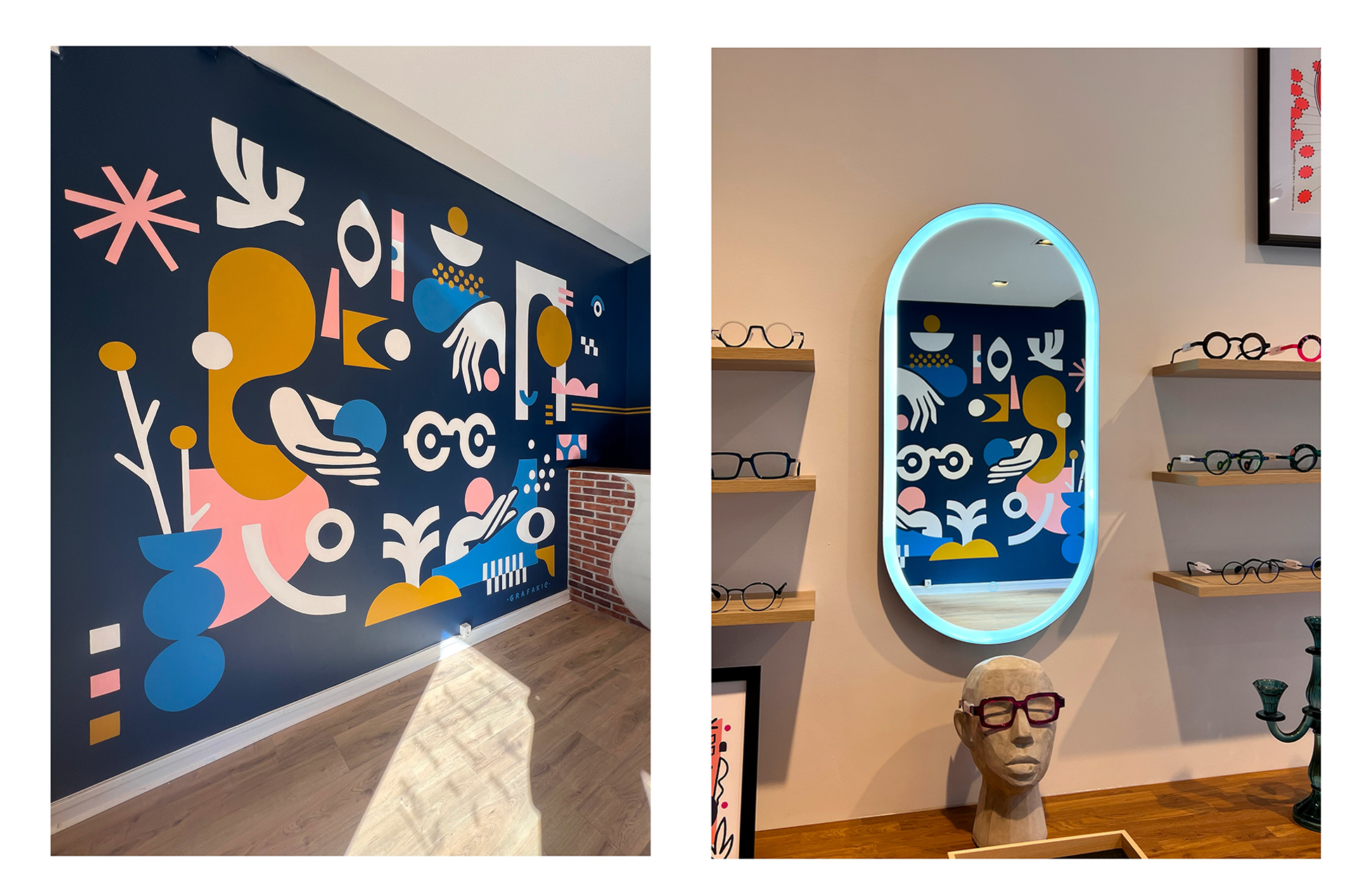
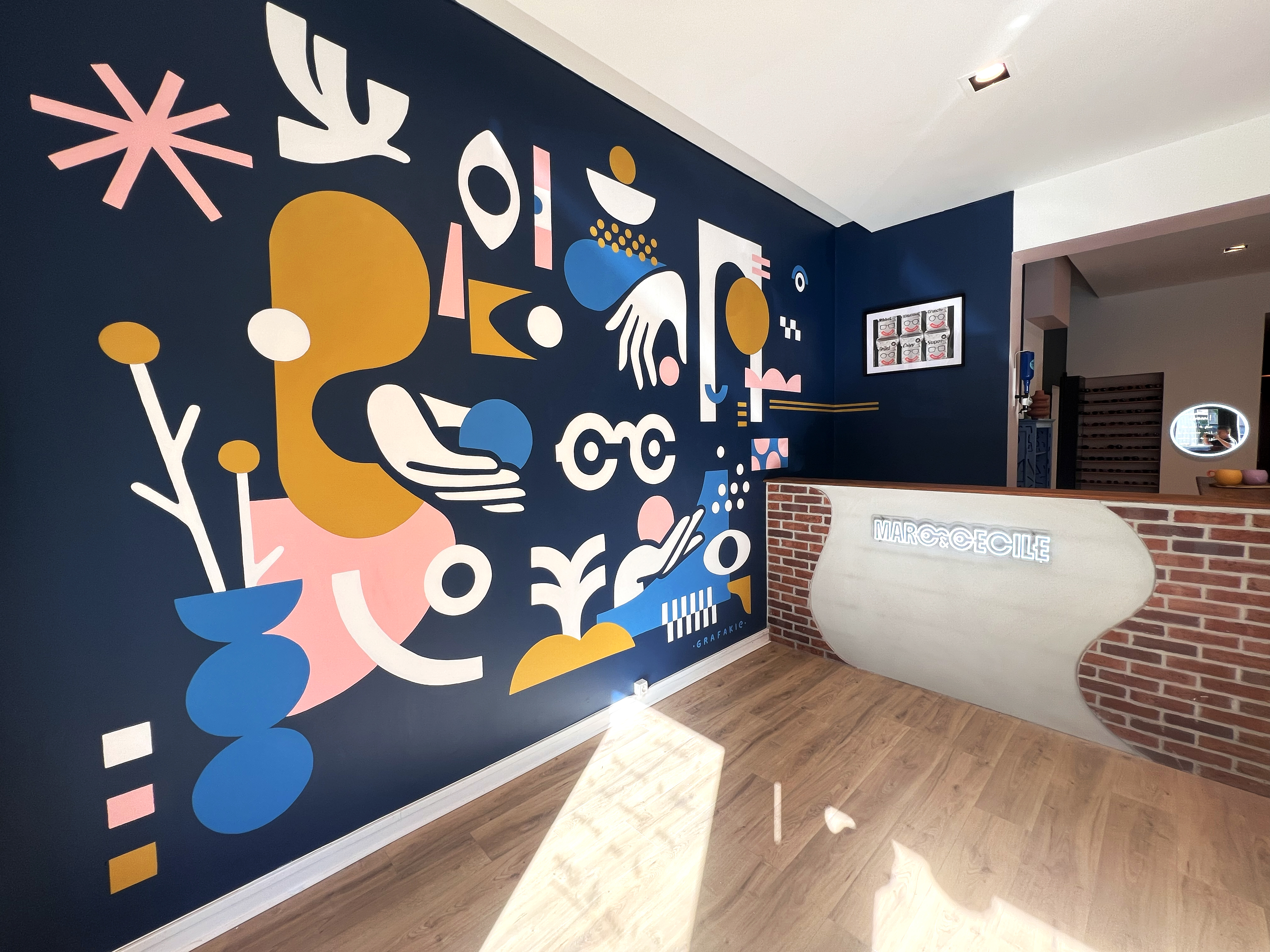
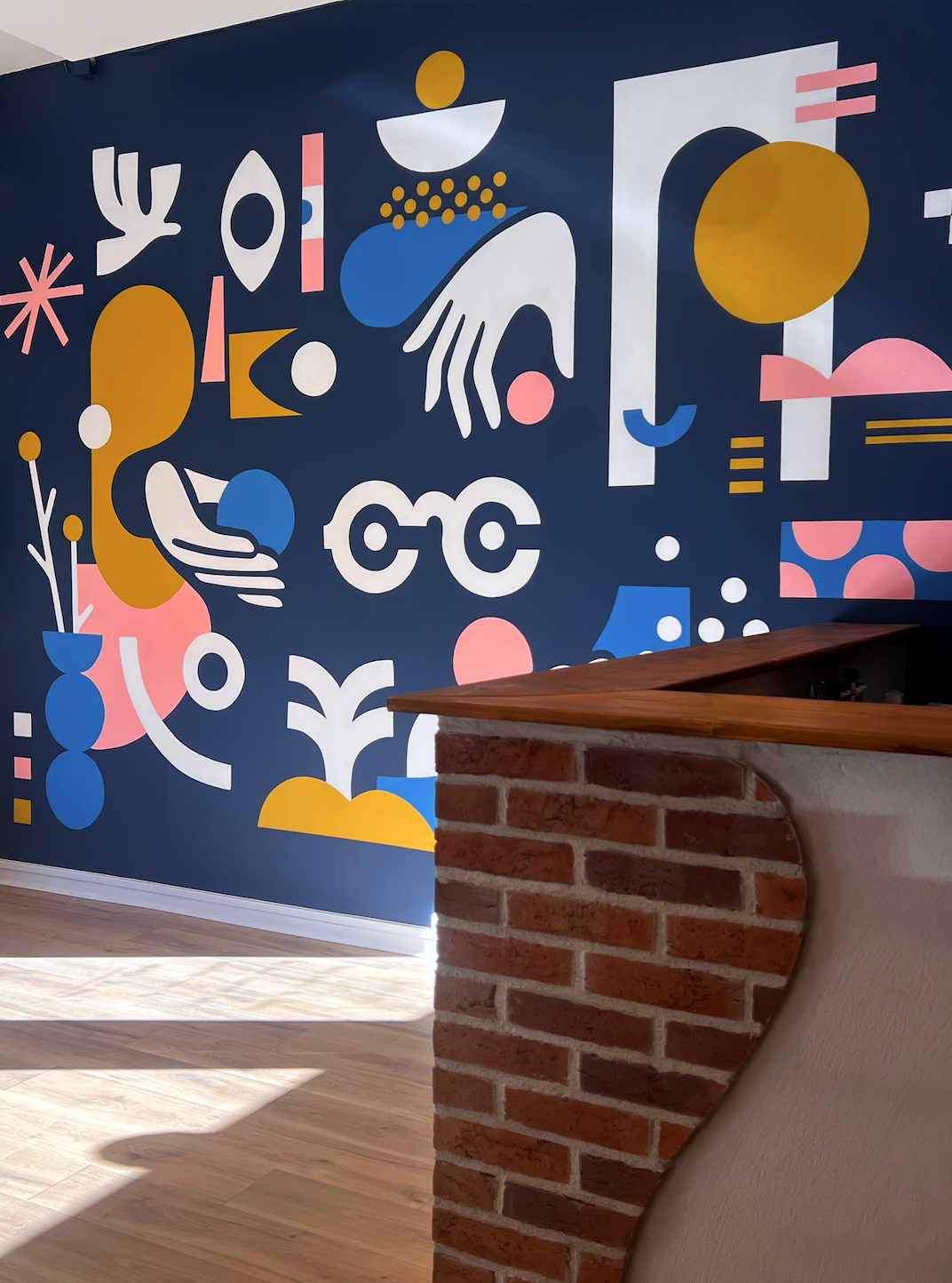
As an extension of this concept, a wall mural was created to dress the shop interior and reinforce the visual universe of the brand.
For this duo of opticians and eyewear designers, the idea was to symbolize a pair of glasses through the letter C, while the temple of the frame is subtly integrated into the letter E.
The overall visual identity plays with the eye motif, drawing inspiration from the Memphis aesthetic.
As an extension of this concept, a wall mural was created to dress the shop interior and reinforce the visual universe of the brand.
The overall visual identity plays with the eye motif, drawing inspiration from the Memphis aesthetic.
As an extension of this concept, a wall mural was created to dress the shop interior and reinforce the visual universe of the brand.



︎
Taverne Grenouille
Taverne Grenouille


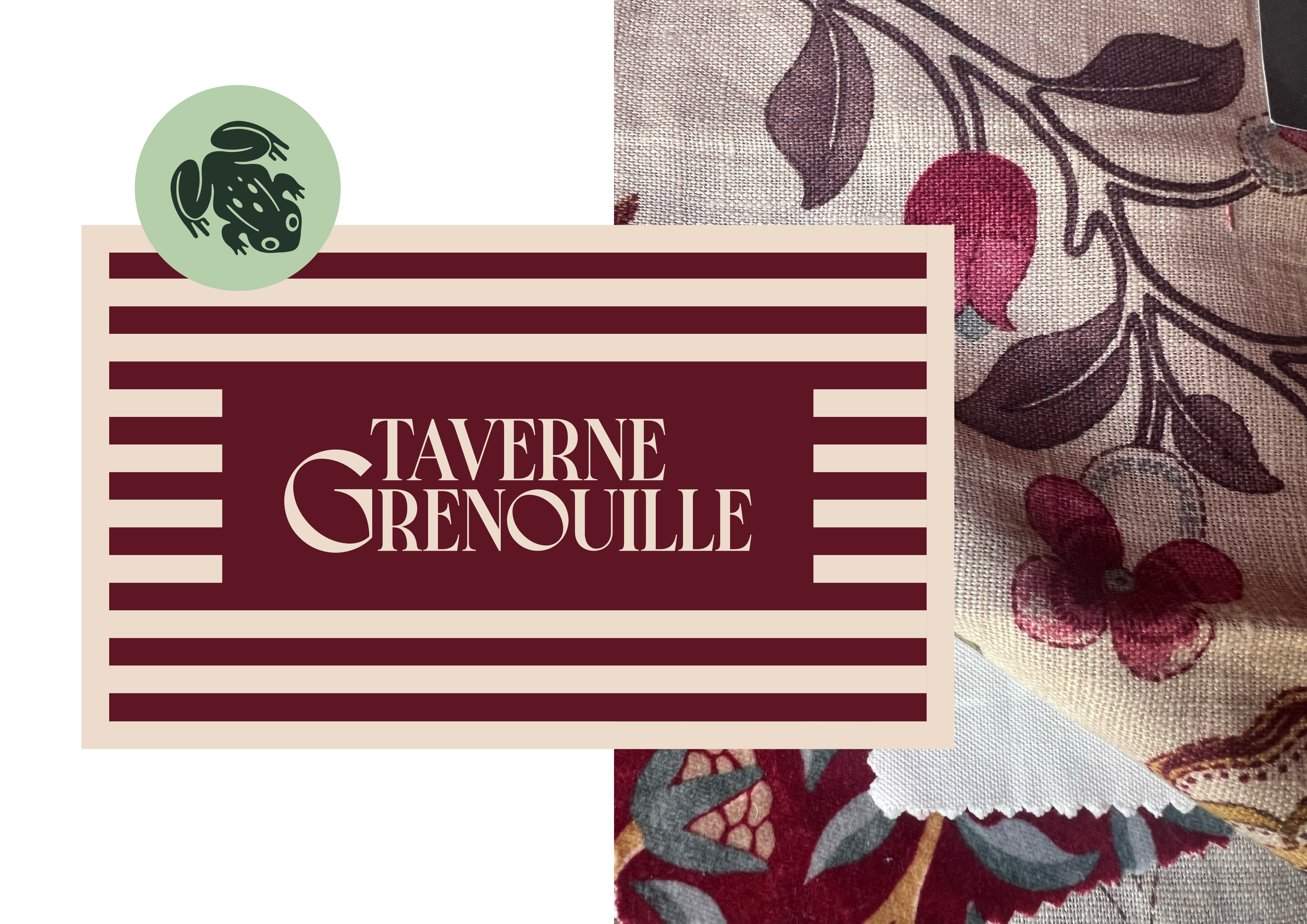
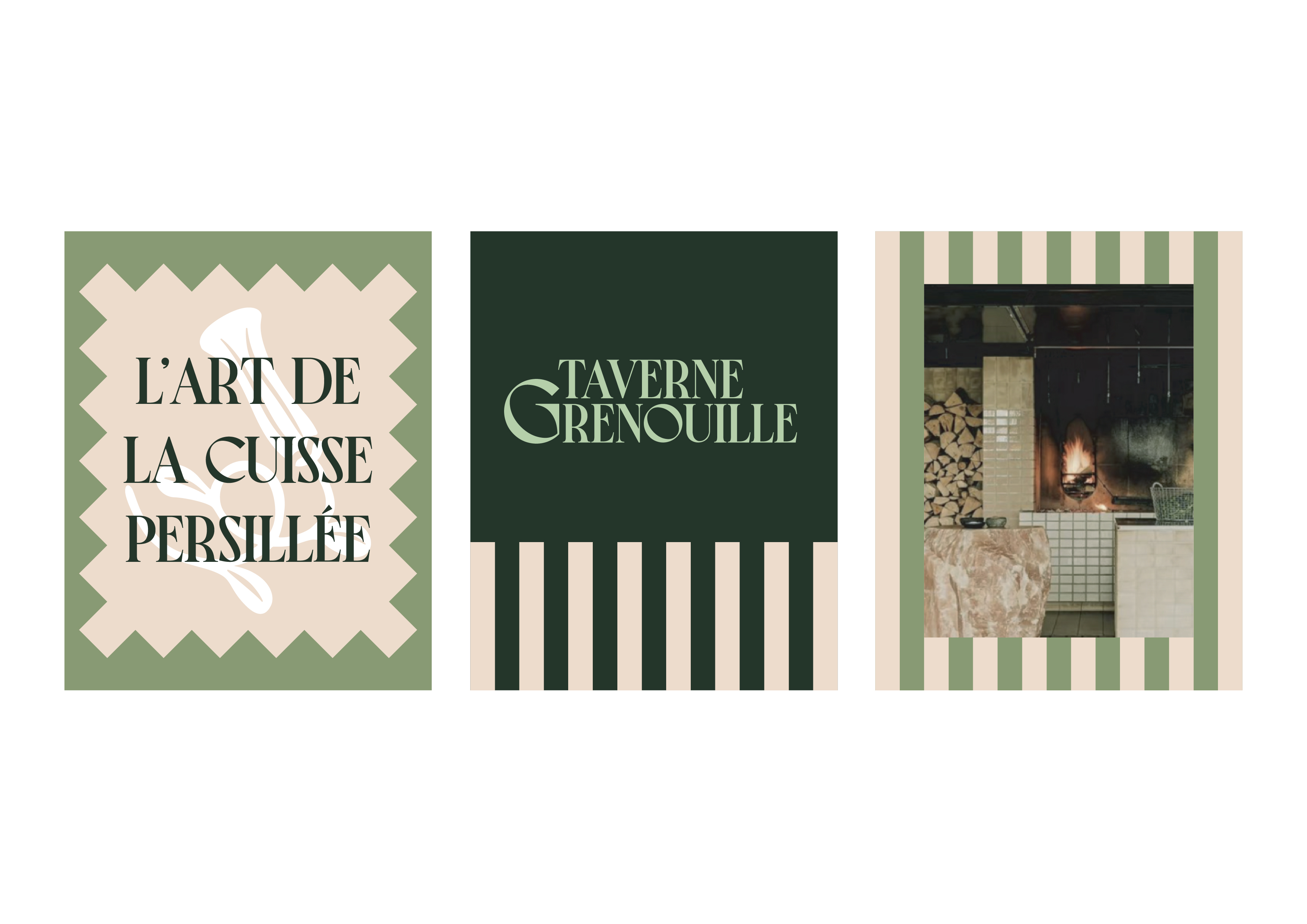
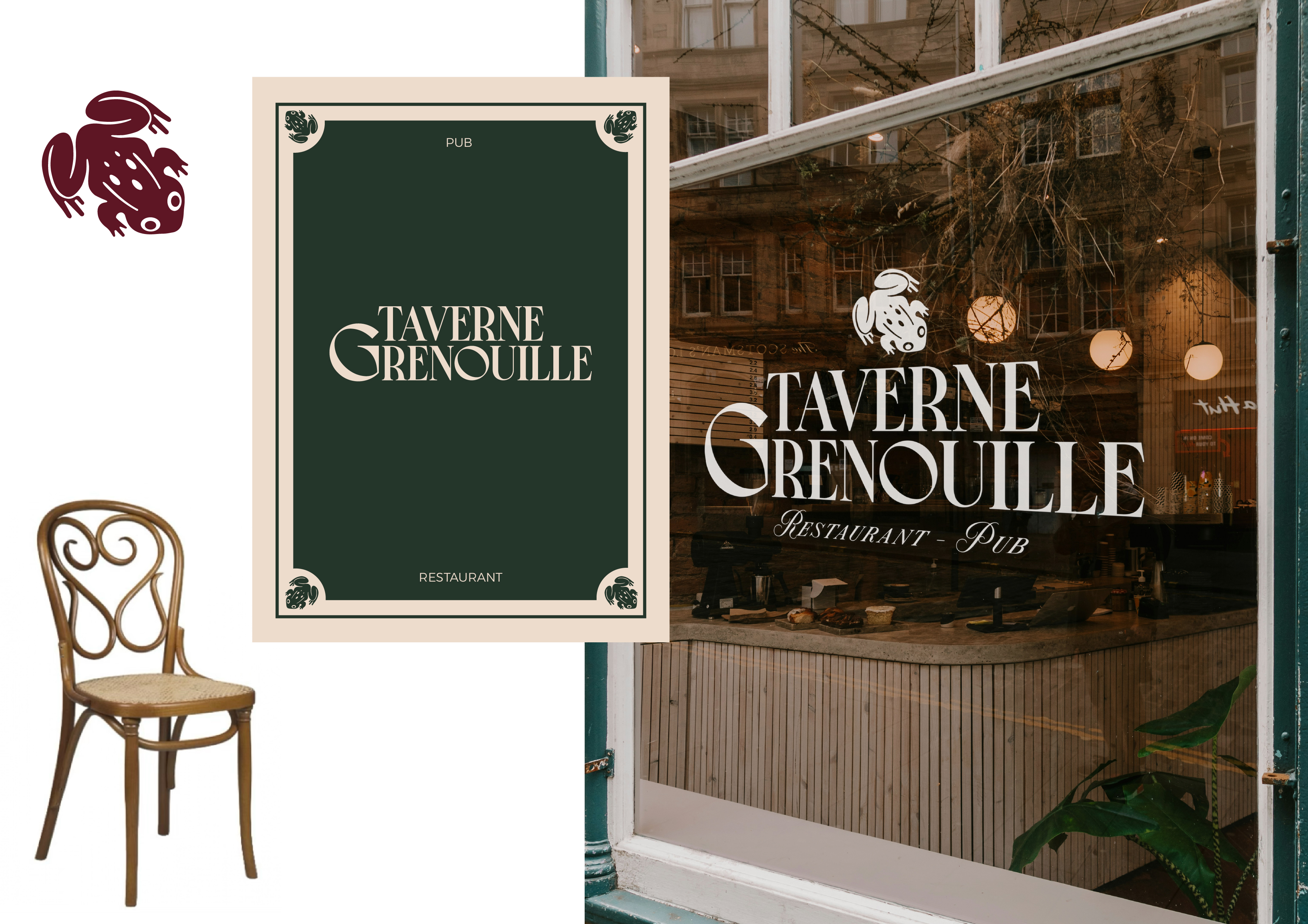
For the identity of this place, where the spirit of a bistro meets the conviviality of a pub, I designed a warm and elegant typographic system, highlighting the letter G, within which a frog leg appears in negative space.
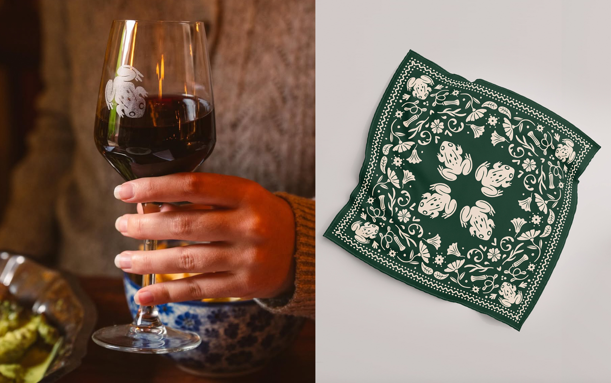
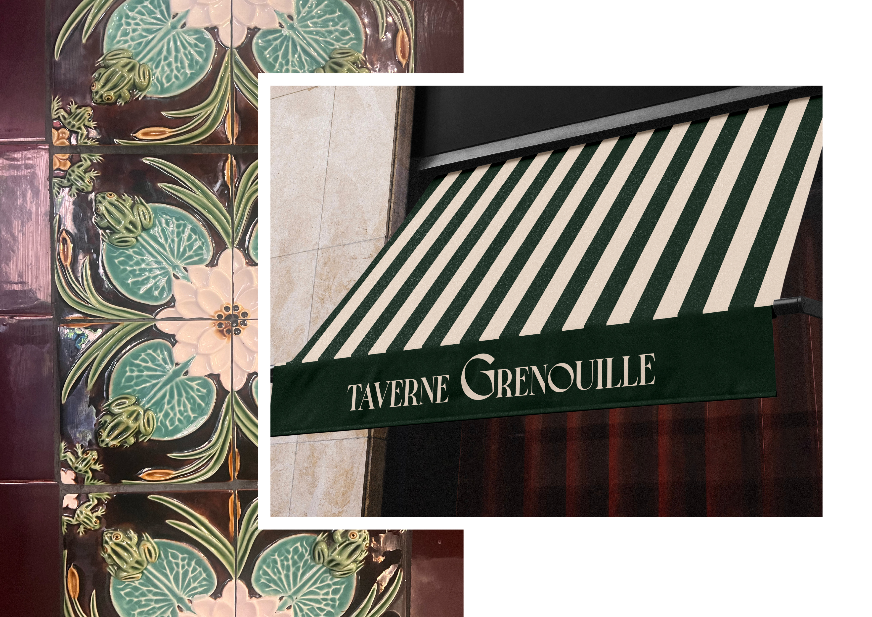
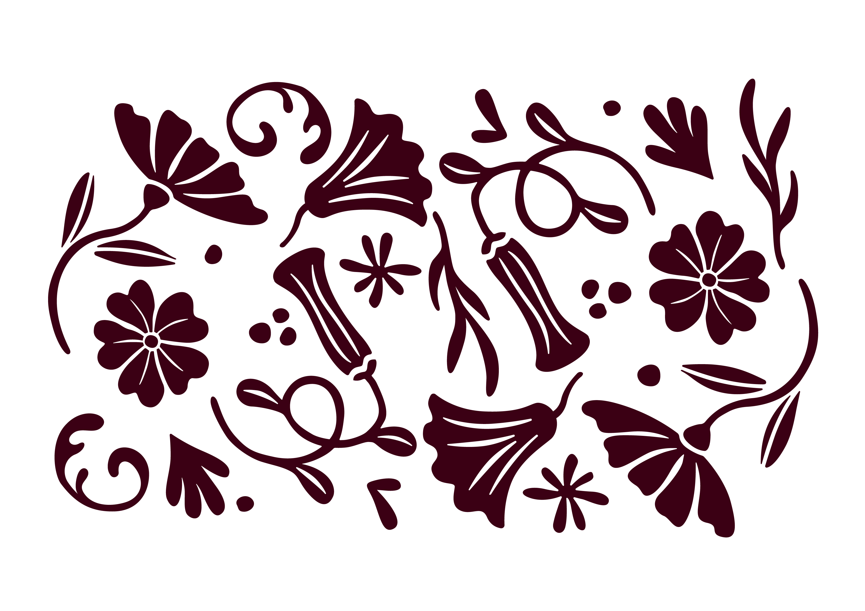
A frog motif inspired by the building’s tiling reinforces the character and identity of the venue, while a linear pattern subtly enhances the tavern spirit in a minimalist way.
For the identity of this place, where the spirit of a bistro meets the conviviality of a pub, I designed a warm and elegant typographic system, highlighting the letter G, within which a frog leg appears in negative space.
A frog motif inspired by the building’s tiling reinforces the character and identity of the venue, while a linear pattern subtly enhances the tavern spirit in a minimalist way.
A frog motif inspired by the building’s tiling reinforces the character and identity of the venue, while a linear pattern subtly enhances the tavern spirit in a minimalist way.